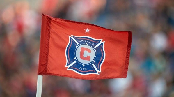
By now, most people in the Chicago area have noticed or come across a change in the Chicago Fire: either that the team is moving to Soldier Field or even more noticeable would be the change in the clubs logo and a club rebrand at that.
The true Fire badge pays homage to the Chicago Fire department with the cross of St. Florian as the base of the badge itself. The top of the Florian cross has the city’s name “Chicago” and the bottom of the Florian cross has the team name “Fire.” In the middle of that we have a circle with six points representing the six pointed hexagonal stars on the Chicago city municipal flag. And within that is a “C” which stands for Chicago.
Overall, the badge is one of the most unique logos in any sport in the world and certainly one of the most unique badges of the Football World. It represents the Chicago Fire Department, one of the stars from the Chicago city municipal flag which represents the Great Chicago Fire of 1871, and it represents the tradition, honor, and passion of the club. It gives the club a unique character and style that stands out in the Football World.
One of the only complaints or confusions about the badge was that it looked too much like the Chicago Fire Department logo. If you ask the confused citizens of Chicago to take a closer look while explaining the significance of the logo itself, it ultimately takes on a character and representation of the club we all know and love.
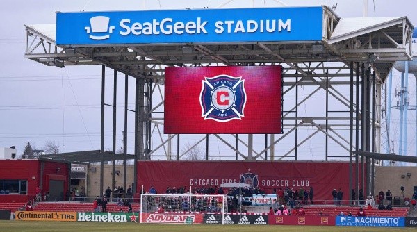
In July of 2019 the Chicago Fire announced that local business entrepreneur Joe Mansueto had purchased a majority of the clubs shares which in turn made him the new club owner. Soon after Mansueto made the proclamation that the Fire would be returning back to the Soldier Field inside the city limits after fourteen seasons at SeatGeek Stadium (formerly Toyota Park) in Bridgeview, IL.
Rumors had entered the internet either of the Fire considering changing their logo but there was no definitive announcement to be had. Then out of the blue in mid to late November there was an announcement that came out of the mlssoccer.com (MLS), the Chicago Fire club, and Joe Mansueto himself: the Fire were rebranding their team name from Chicago Fire Soccer Club to Chicago Fire Football Club and they were also changing their logo.
Gone was the grand logo of the Chicago Fire which almost all Major League Soccer (MLS) fans agreed was one of the best logos the league had ever had and produced. It was replaced with two vertical ovals, one bigger than the other and both the color read, with the “Chicago” being at the top of the logo (in yellow font) and “Fire FC” (also yellow font) aligned on the bottom of the double ovals. In the middle, there are mirrored triangles which have come to be known as the “Fire Crown.” The bottom half of the “crown” is red and represents city of Chicago being burned and fallen due to the Great Chicago Fire with the top half of the “crown” representing the rebuilding period and the rise of the city and where it is today compared to how it was in ruin. The rest of the logo is filled in with navy blue.
Most fans have shown and wrote of their disgust and distaste for the new logo saying that it is a poor representation of the city and it is the worst logo in MLS (Major League Soccer). The triangles do not really pop out as flames or a crown to anyone who views it. It comes off as a gang logo similar to that of the latin kings, a rip off of the diamonds/ triangles of the Vancouver Whitecaps FC logo, and also seems to be taking the colors almost directly from Real Salt Lake. The only thing that is distinctly “Chicago” about the logo is the city’s name at the top of the double ovals.
Based on the appearance alone it seems there was very little thought put into it and that it very possibly was made off the commonly well known and cheap “Paint” program that is found on my computers and laptops. Anyone in grade school could have possibly put it together and it could have been done in a couple days if not even under an hour with the proper motivation.
In conclusion, the new logo fails to appropriately capture the passion of the club, the embodiment of the city of Chicago, and the depth of the event the club is named after. Although the concept is interesting and has potential I believe a lot more work should have been put into the rebrand especially after having one of the best logos in league history.
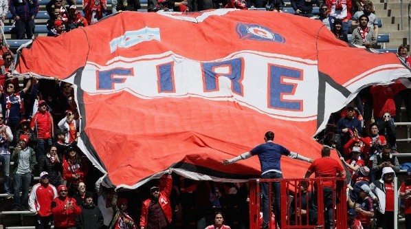
The true Fire badge that we all know and love will always be in our hearts. We will always keep and wear the passion, honor, and tradition at games and during our daily lives. And we will always support our great club! And who knows; maybe a new owner will eventually bring back the true Fire badge!