The aesthetics of sports has never been bigger business. Teams are constantly upgrading and updating their looks to keep up with the current styles. With that said, there are few better NFL preseason exercises than redesigning team helmets!
This article focuses on two standout designers that have done just that. Concept 1 comes to us from the designer Ted Hyman, whose work you can find on his Instagram page. Concept 2 comes to us from two contributors to the sports uniform website, Uni-Watch. Flip through and check out these really awesome designs. Good luck figuring out which is your favorite.
Tampa Bay Buccaneers 1
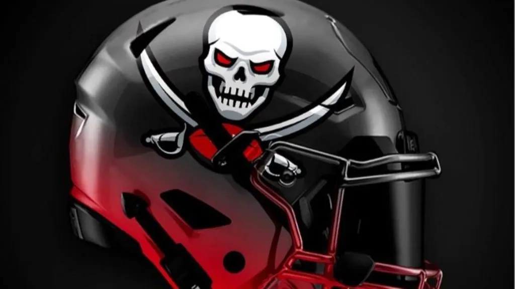
(Instagram)
Concept 1 for the Bucs is excellent. How cool is the skull and crossbones logo on the side of that helmet? While we’re not usually a fan of gradient designs, this red and black gradient on this helmet work incredibly well. The gradient even extends to the facemask. Grade: A
Tampa Bay Buccaneers 2
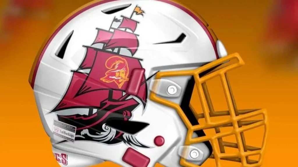
(Uni-Watch)
The only way Concept 1 would have been outdone is by putting an entire pirate ship plus the old Bucco Bruce logo on the helmet. That’s exactly what has happened on Concept 2. This helmet is without peers in this group. It’s a masterpiece. We’ll start the petition now to get Tom Brady in this helmet ASAP. Grade: A+
Kansas City Chiefs 1
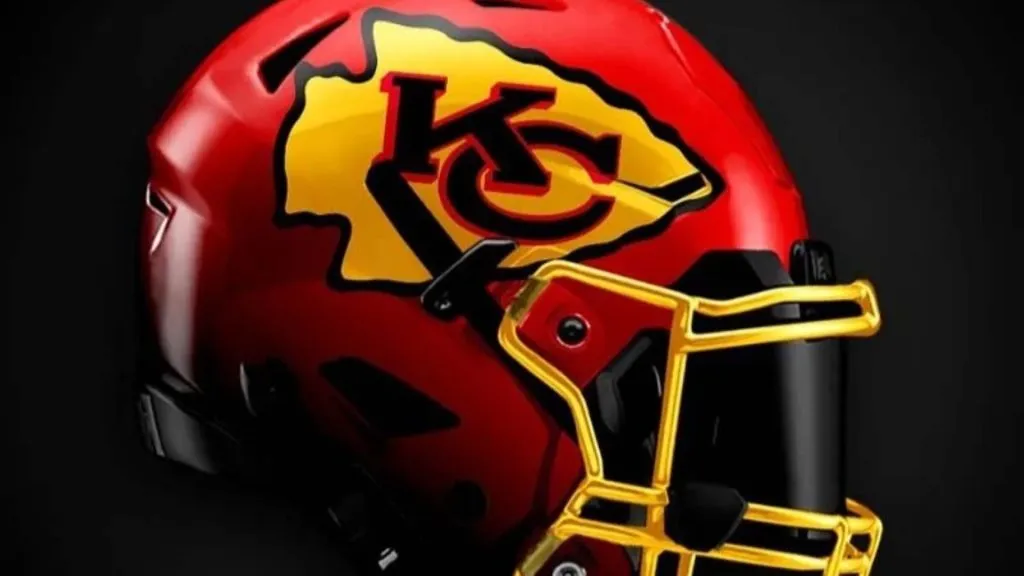
(Instagram)
It’s hard to improve on an all-time great. With that in mind, Concept 1 has simply swapped out white with gold. While normally we’d say that it’s a good idea to add more color, in this case, we don’t think so. The gold chrome facemask is startling and doesn’t fit with the rest of the helmet. Grade: C-
Kansas City Chiefs 2
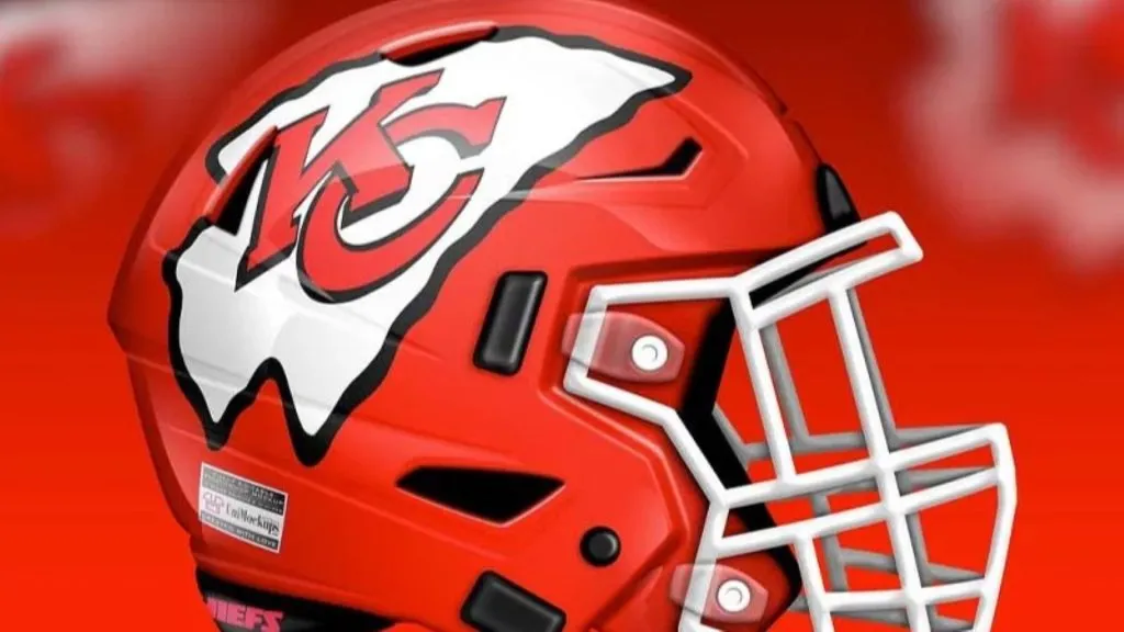
(Uni-Watch)
Concept 2 has stuck with the original design with some slight, but damaging changes. What has happened to the Chiefs logo? It looks as if it is a balloon that has come unknotted and is deflating midflight. Or like it’s one of Salvador Dali’s famous melting clocks. Something’s not right here. Grade: C
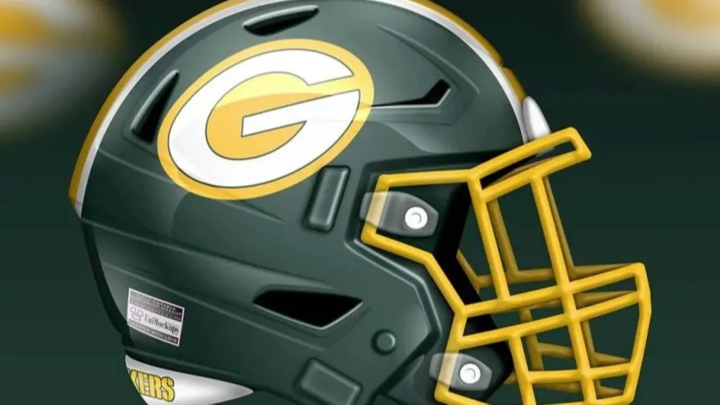
Green Bay Packers 1
(Instagram)
Here’s another classic that it’s difficult to improve on and not commit sacrilege by updating. Concept 1 goes with their tried and true method of putting some stripes on the bottom of the helmet. It’s not bad, it just looks weird to have the Packers helmet be anything but plain and simple. Grade: C+
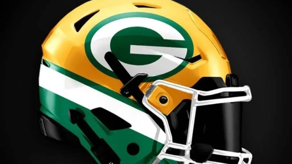
Green Bay Packers 2
(Uni-Watch)
Concept two has simply inverted the colors. Instead of a yellow helmet, we have a green helmet. And actually, it’s quite good. The yellow really pops on the facemask and the logo. We quite like this look. Grade: B+
Jacksonville Jaguars 1

(Instagram)
Concept 1 has the Jaguars going back to the two-tone look that they tried out a few years ago. The upgrade here is the teal fades to black and not black to gold. It’s a much better look. The two-tone face mask is really cool too. Grade: B+
Jacksonville Jaguars 2
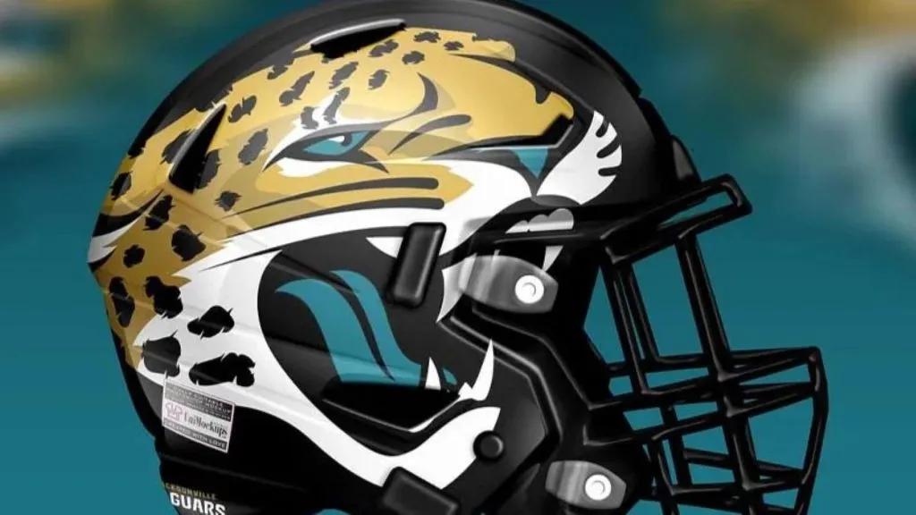
(Uni-Watch)
Concept 2 smacks a gigantic jaguar all over the side of the helmet. It’s big, it’s bold and it’s in your face like you’d expect a jaguar to be if you met one in the jungle. If it’s got the big cat on both sides then this is a really good helmet, but because of the way it wraps around the back we’re skeptical it only is on one side. Grade: B-
Tennessee Titans 1
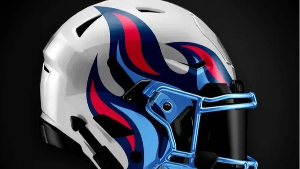
(Instagram)
Concept 1 for the Titans has to be one of the finest redesigns in the entire set. The original Titans/Oilers colored flames coming off the facemask is awesome. The fact that the facemask is light blue shows an attention to detail that is unmatched. Really good job. Grade: A+
Tennessee Titans 2
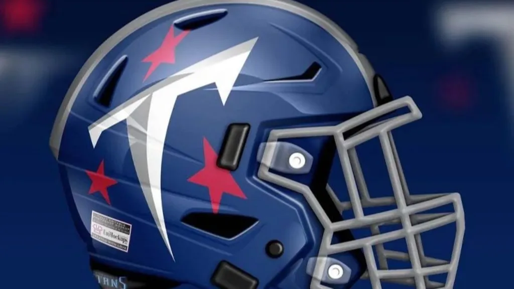
(Uni-Watch)
Concept 2 is not quite as good. They’ve used the more recent Titans color scheme, which quite frankly isn’t as good. It’s just dull. Beyond that the Titans logo has been reduced to just a goofy T. Overall the logo lacks that “it factor” that makes some of these helmets pop. Grade: C
Indianapolis Colts 1

(Instagram)
The Colts have one of the most traditional looks in all of football, so it’s nice to see the modern touches put on the helmet in Concept 1. The white stripes really pop and give a classic look a much-needed update. Grade: B
Indianapolis Colts 2

(Uni-Watch)
The artist had tried to hard in Concept 2. Yes, when you turn a horseshoe on its side it looks like a “C” for Colts, and yes the horseshoe fits better on the helmet turned like that but it doesn’t make much sense to turn it like that. The luck flows out of the horseshoe if it’s pointing the way it is traditionally positioned on the Colts helmet. Don’t mess with luck! Grade: C
Houston Texans 1
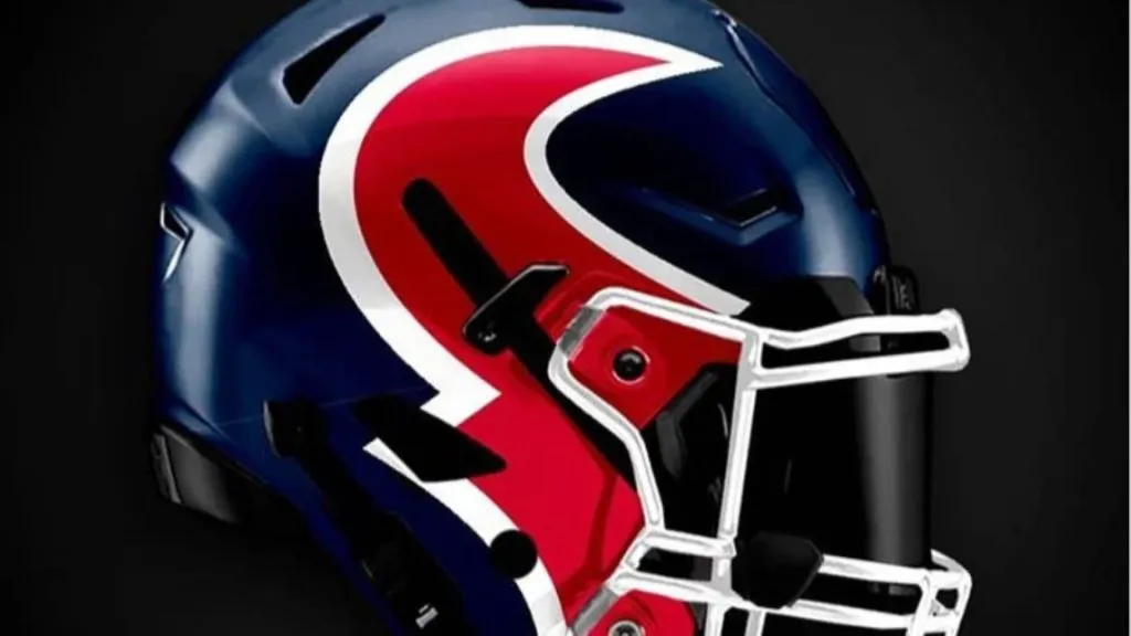
(Instagram)
For Concept 1 the artist has taken the logo and put half of it on either side of the helmet, making it look like you’re looking into the face of the bull. That’s a pretty cool look, but it’s possible the white facemask blows the illusion. Close, but no cigar. Grade: B+
Houston Texans 2
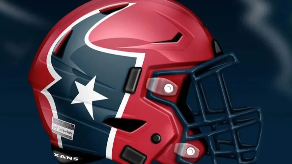
(Uni-Watch)
To the designers of Concept 2, we have just one question. Where’s the other half of the logo? On the helmet, we only see the blue half. Where’s the rest? This is no good. Grade: D
New England Patriots 1
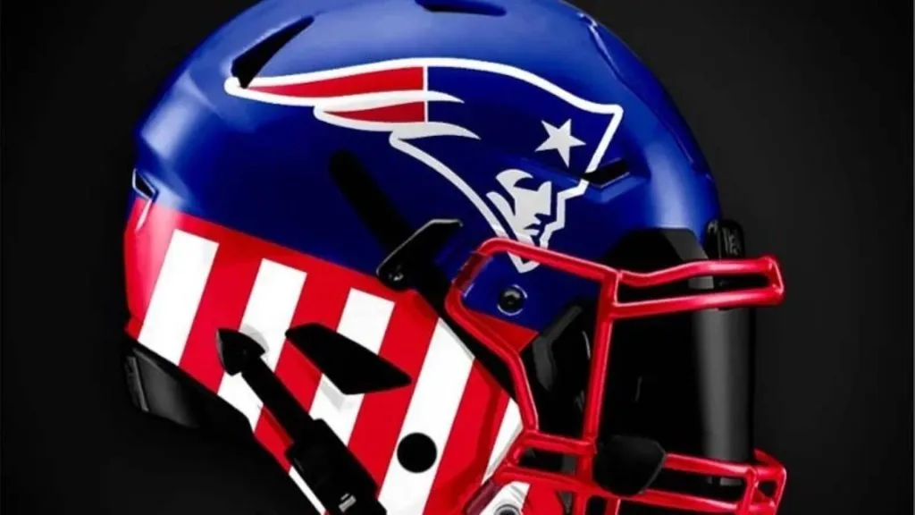
(Instagram)
Concept 1 is a mixed bag. There are things to like here like the blue helmet, the chrome red facemask, and even the stripes. The problem is those all look good individually, but together they clash. It’s just too busy. Grade: C-
New England Patriots 2
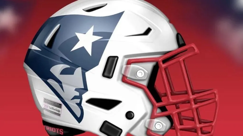
(Uni-Watch)
Concept 2 is brilliant. This is a helmet. Patriot Pat is big and bold. The white helmet is fresh, especially with the red facemask. Tom Brady is gone, it’s time for a new era. This is it, and it’s excellent. Grade: A-
New York Jets 1
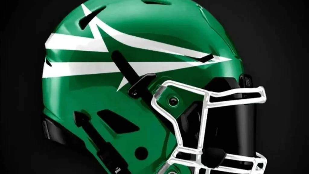
(Instagram)
For Concept 1 the artist has reworked the logo a bit to make it more modern and even minimalistic. The problem is they’ve gone a bit too far. It’s nearly impossible to tell what that is on the side of the helmet without already knowing you were looking at the Jets helmet. Grade: C-
New York Jets 2
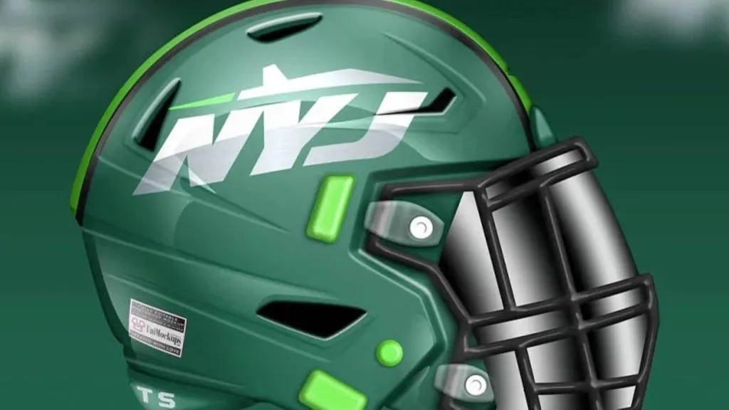
(Uni-Watch)
Concept 2 really nails it. The logo is clear, and stands out. There’s clearly a jet on top of the NYJ, for New York Jets. The helmet introduces that seafoam green that has worked so well up in Seattle. The Jets are already the second team in New York, why not try something that’s already working for someone else? Grade: B+
Miami Dolphins 1
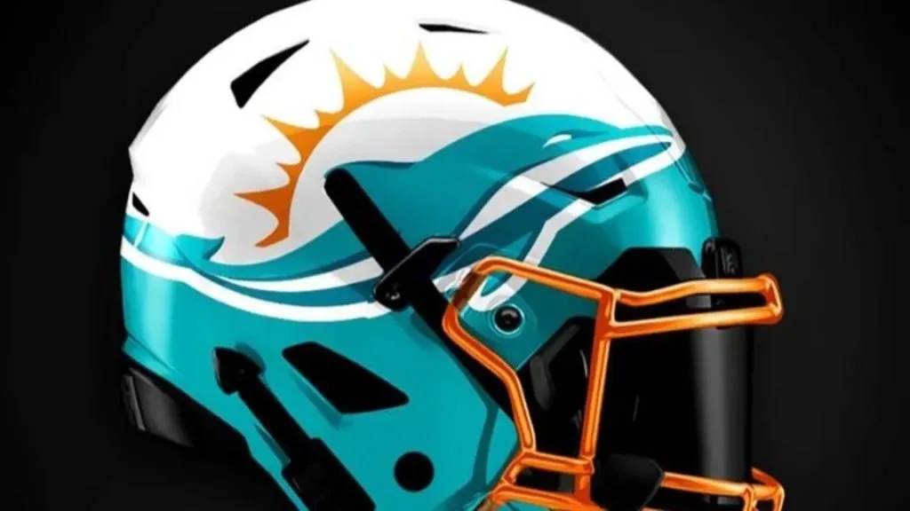
(Instagram)
The Miami Dolphins should always have some of the coolest uniforms and helmets in the league but recently they have been missing the mark. Concept 1 is trying just a little too hard. The lower half of the helmet features teal, for the water. The upper half is white and is supposed to be above the water, where the sun is. It’s clever but to complicated for a football helmet. Grade: B-
Miami Dolphins 2
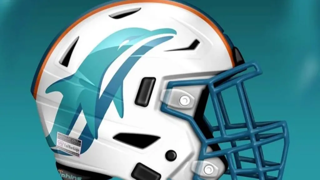
(Uni-Watch)
Concept 2 gets it right. It’s simple, put a big dolphin on a white helmet with teal and orange stripes. It’s an update on the classic look the team has worn forever. Well done. The only way this could be better is if the Dolphin was wearing a helmet, like in the original logo. Grade: A-
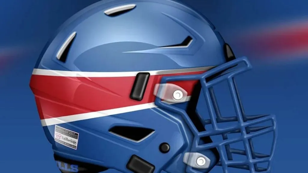
Buffalo Bills 1

(Instagram)
The Bills have one of the coolest logos in the league, so they did the right thing with Concept 1 to leave it alone. The blue helmet is interesting, but the real star of this show is the red white a blue helmet stripe down the center and the red facemask. It’s a standout look. Grade: A
Buffalo Bills 2
(Uni-Watch)
Nope, don’t like it. Concept 2 has taken the idea of minimalism to an unhealthy level. Sure, that stripe is the stripe coming off the buffalo in the Bills logo, but where’s the buffalo? The buffalo is bringing the energy, hence the stripe. But if he isn’t there, there can be no stripe. Grade: F
Cincinnati Bengals 1
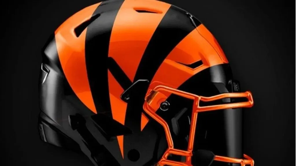
(Instagram)
They didn’t have to do much to make Concept 1 a winner. The helmet looks darker, more menacing. Essentially they took an orange helmet with black stripes and made it a black helmet with orange stripes. The change is subtle but powerful. This is an impressive look. Grade: A
Cincinnati Bengals 2
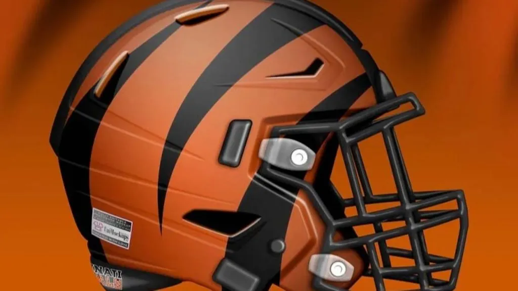
(Uni-Watch)
Concept 2 has done the opposite of Concept 1. Fewer stripes, more orange. The helmet seems calmer, more peaceful. Is that what we want on a football helmet? We don’t want the tiger in the zoo, we want the tiger in the jungle, ready to pounce. This tiger here is tame. Grade: C
Pittsburgh Steelers 1
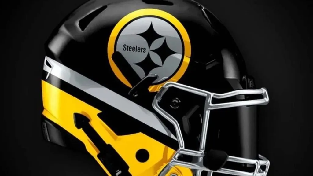
(Instagram)
This Steelers helmet received a similar treatment to the Colts helmet. Stripes on the bottom of a classic helmet. It works well here, and actually these stripes are better because they are two different colors. This is a pretty good look. Grade: B
Pittsburgh Steelers 2

(Uni-Watch)
Oh boy. Concept 2 goes hard into the Steelers logo. Sure it’s unique to the Steelers identity as it is the logo belonging to the American Iron and Steel Institute, and is known as the Steelmark. The problem is without the rest of the logo it looks like the face paint of a court jester. And nobody wants to be a jester. Grade: C
Cleveland Browns 1
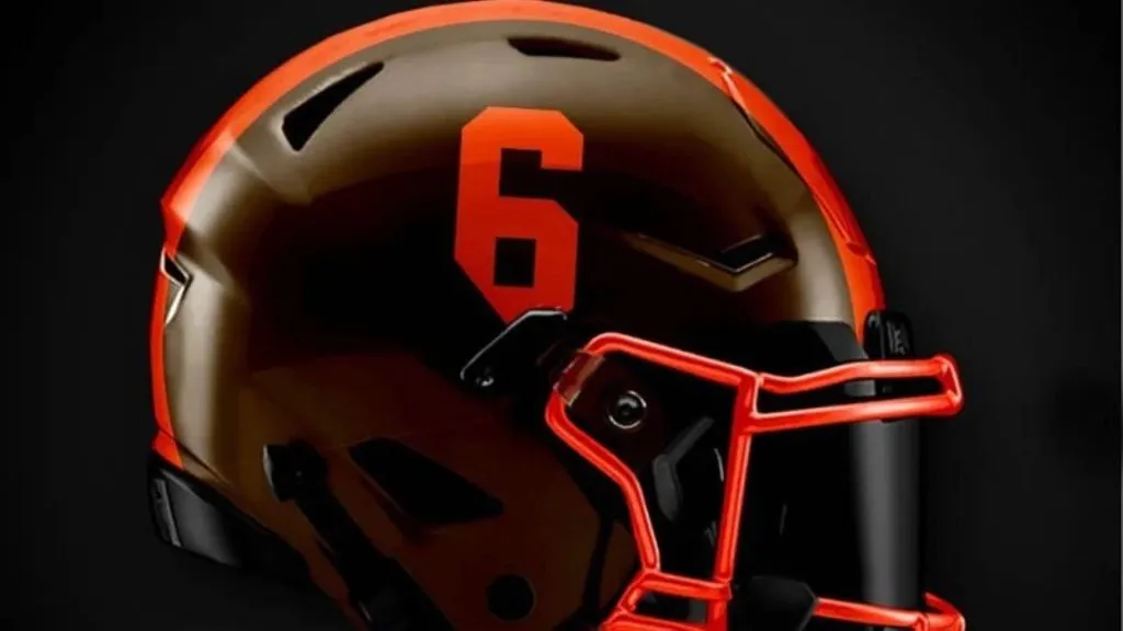
(Instagram)
Concept 1 seems to be inspired by the Browns color rush uniforms they have been wearing over the last few seasons. If you must change the Browns already perfect helmet, this isn’t bad. The number on the side is a nice traditional touch for a very aesthetically traditional team. Grade: B
Cleveland Browns 2
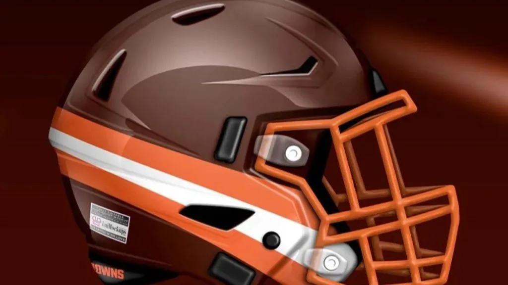
(Uni-Watch)
We’re going to stop you right here Concept 2. The helmet stripes go down the middle of the helmet, not from the back of the head to the jawline. For what it’s worth, any Browns helmet redesign that does not feature Brownie the Elf is missing an obvious home run. Grade: C-
Baltimore Ravens 1
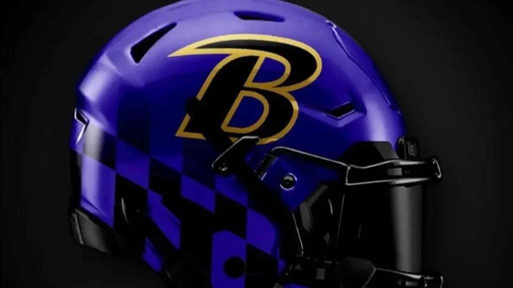
(Instagram)
Concept 1 is excellent. Gone is that weird bird, thankfully. The stylized B is cool, but the real winner here is the Maryland state flag pattern that is subtlety and menacingly lingering at the bottom of the helmet. Put a black facemask on this bad boy and you’ve got yourself the instrument of a modern-day gladiator. Excellent work here. Grade: A
Baltimore Ravens 2

(Uni-Watch)
As awesome as Concept 1 is, Concept 2 is equally lame. It’s like the dad-bod version of Concept 1. The cool B is back but it looks like it’s being warped in one of those funhouse mirrors. Reminder, those are to make you look silly, not cool. It’s just not good. Grade: D
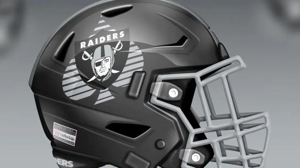
Las Vegas Raiders 1
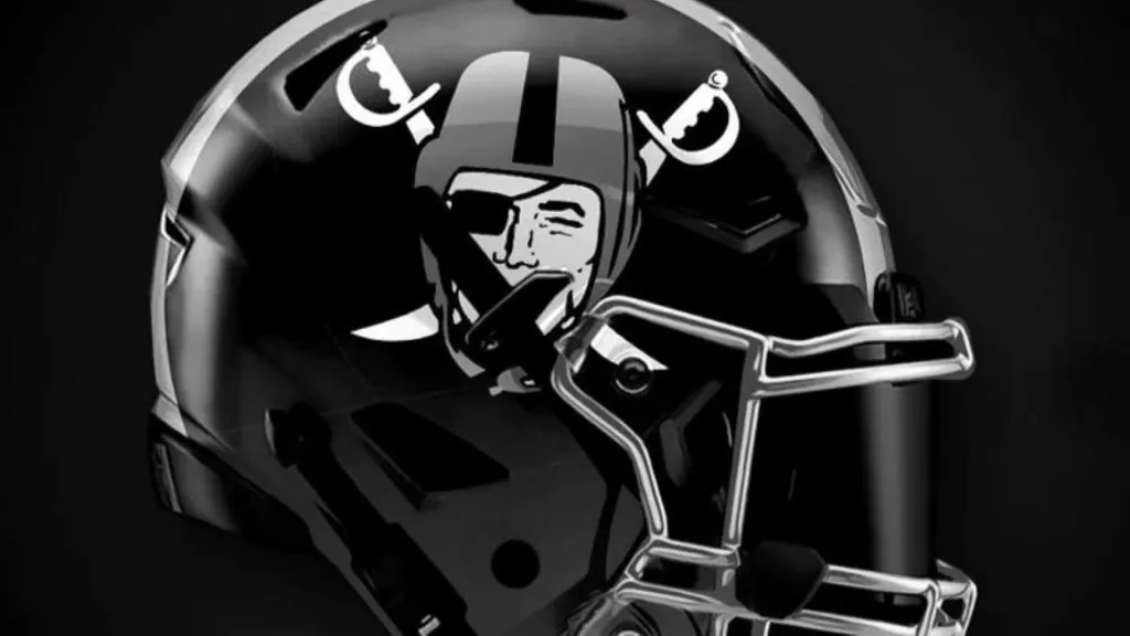
(Instagram)
The Raiders have such a solid and classic look it’s tough to improve on it, but Concept 1 has. Throw the Raider logo on a black helmet instead of a silver one and you’ve got an incredible look suitable for the new black hole in Las Vegas. Grade: A
Las Vegas Raiders 2
(Uni-Watch)
Concept 2 two is a nice nod to the Raiders’ new home in Las Vegas. The spade underneath the Raiders logo could work for their inaugural season as a tribute to their new home town, but after that, you’d think they’d want to remove it. It’s more Las Vegas than it is Raiders. Grade: B
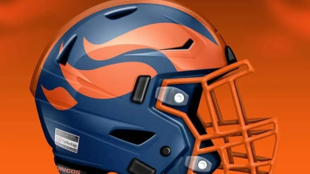
Denver Broncos 1

(Instagram)
It seems like every time there is a Broncos helmet update the artist incorporates the light blue from the Orange Crush days of the Broncos. What has happened with Concept 1 is a merger of the two helmets. The color scheme is from the Orange Crush, but with the modern Broncos logo. It’s ok, but nothing to get too excited about. Grade: C+
Denver Broncos 2
(Uni-Watch)
Concept 2 is interesting, but a bit difficult to look at. There’s something about the shade of orange used that’s off-putting. So they’ve obviously tried to show the broncos mane on the side fo the helmet, which could be neat. The execution here is poor, however. Grade: C
Chicago Bears 1
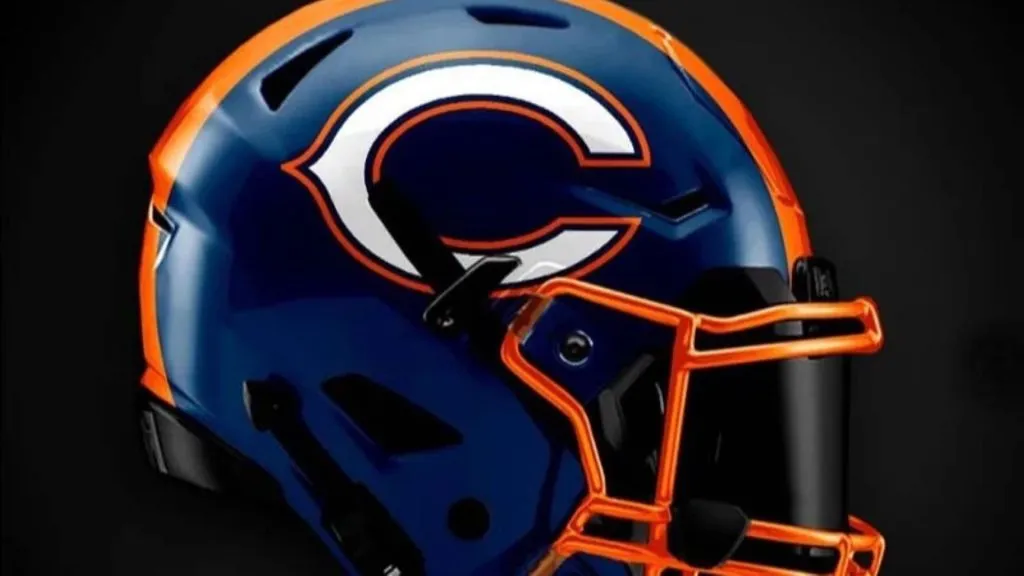
(Instagram)
Not much has changed from the standard-issue Bears helmet here in Concept 1. The main difference is the pop of orange on the facemask and the helmet stripe. It’s a really sharp update. The additions bring this helmet into the 21st century. Grade: B+
Chicago Bears 2
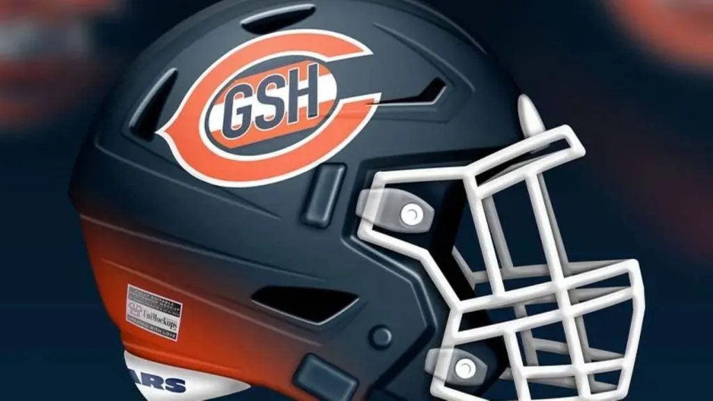
(Uni-Watch)
Concept 2 does a few interesting things. The most obvious is bringing the GSH, in honor of George Halas, up to the helmet from the jersey sleeve. The orange gradient at the back of the helmet is interesting but just ends up looking cheap and gimmicky. Grade: C
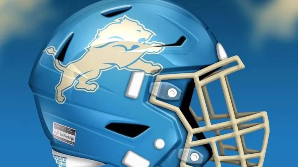
Detroit Lions 1

(Instagram)
Concept 1 knocks it out of the park for the lions. This is a stunning helmet. The electric blue profile of the lion on top of the midnight black helmet is outstanding. The blue facemask gets a bit mixed up in the lion outline but we’ll let it slide. This one is excellent. Grade: A
Detroit Lions 2
(Uni-Watch)
Concept 2 is ok. It’s a really easy look to appreciate, it’s just that the cream color for the logo and facemask is throwing us off a bit. It’s not bad, it just looks like it’s not supposed to be there. Maybe we’re just so used to seeing grey than anything else looks out of place. Grade: C
Minnesota Vikings 1
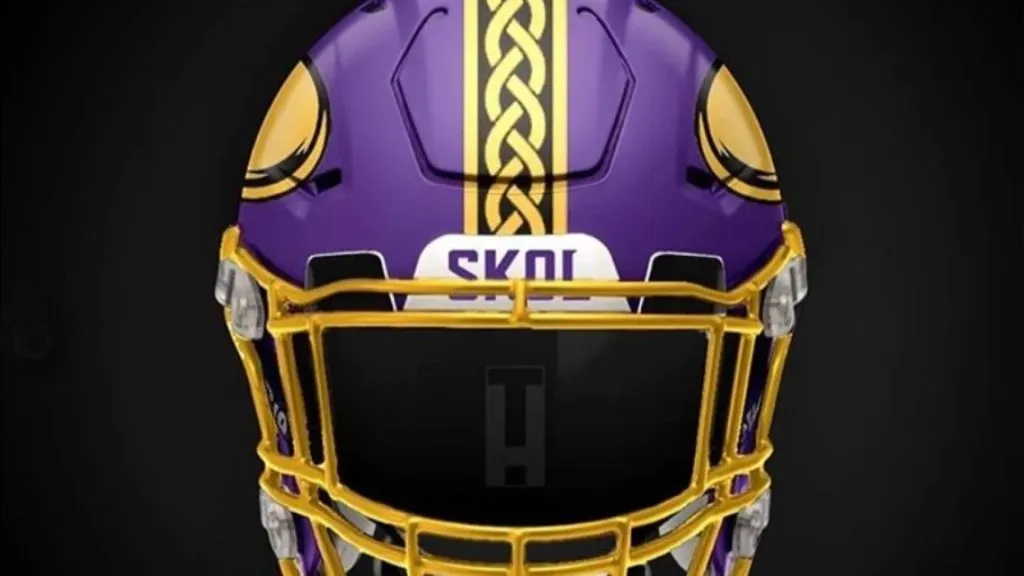
(Instagram)
At first glance, Concept 1 looks pretty similar to the current Vikes helmet. The artist has prioritized gold in favor of white, but that’s pretty much it. What takes this helmet to the next level is the Viking braid down the center stripe on the helmet. That is an incredible addition that should be added to the current Vikings helmet immediately. Grade: A
Minnesota Vikings 2
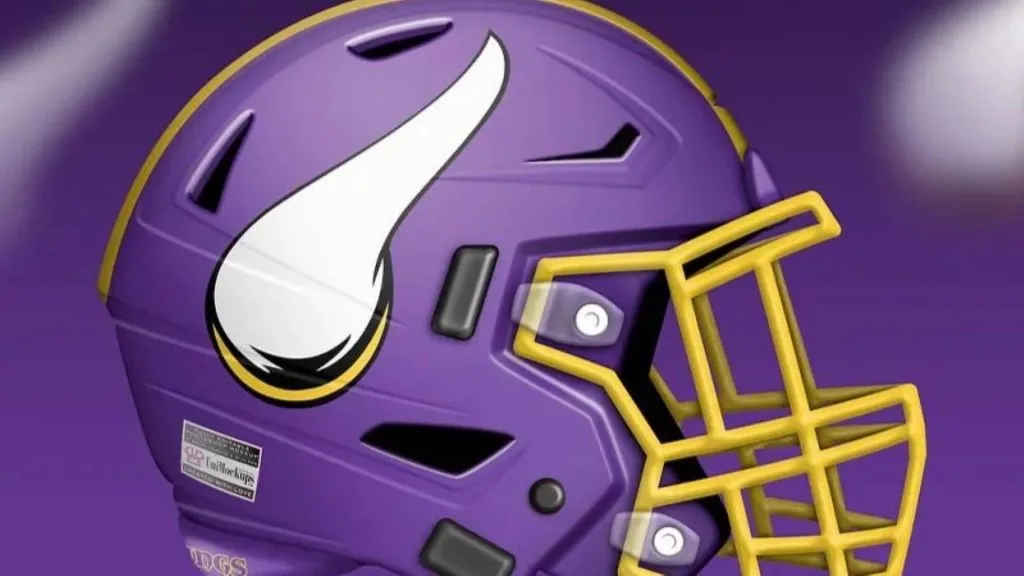
(Uni-Watch)
Concept 2 has thrown the Vikings helmet for a loop. They’ve changed the orientation of the helmet horn. It’s turned upward instead of back. We aren’t here to discuss the historical validity of either horn orientation, but we have to admit it’s off-putting to see it in a different direction. Grade: B
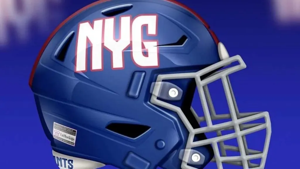
New York Giants 1
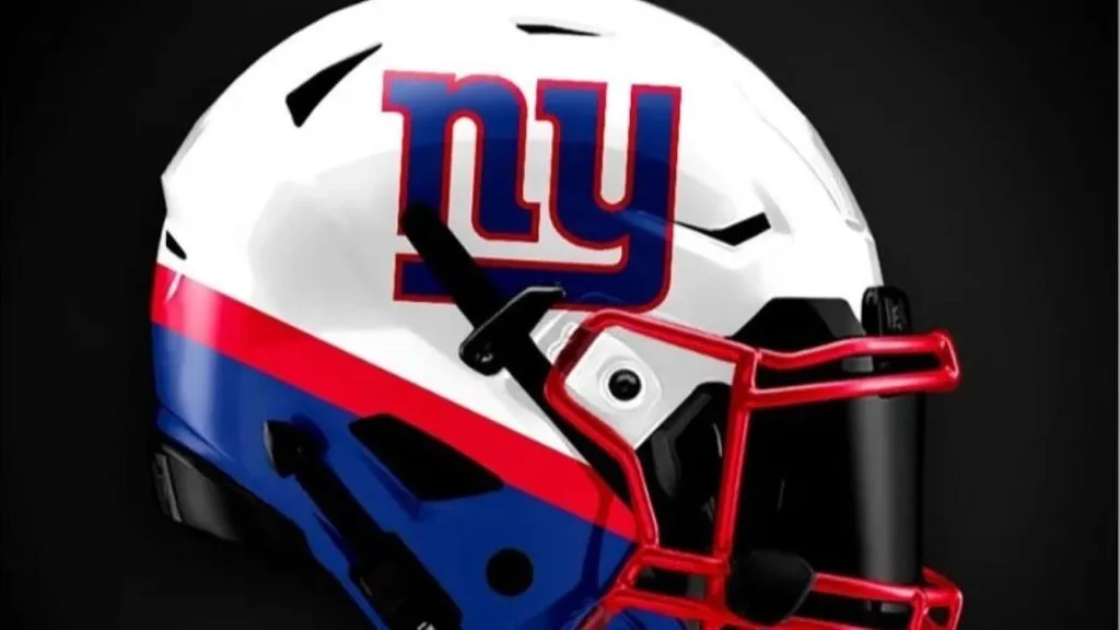
(Instagram)
Concept 1 is back with the bottom stripes and this time we are all about it. The colors do all the work here. Maybe it’s just the inherent patriotism of a red, white, and blue helmet but the look is terrific. The Giants have waffled between essentially the same two bland helmet designs for decades. This would be a welcome upgrade. Grade: A-
New York Giants 2
(Uni-Watch)
Speaking of the same boring helmet designs, enter the Concept 2 design. There is nothing exciting about this look. At least the current logo has a neat interlocking letter feature. This is boring. Sure, there’s a bit of boldness communicated through the font choice but that’s about it. Grade: C-
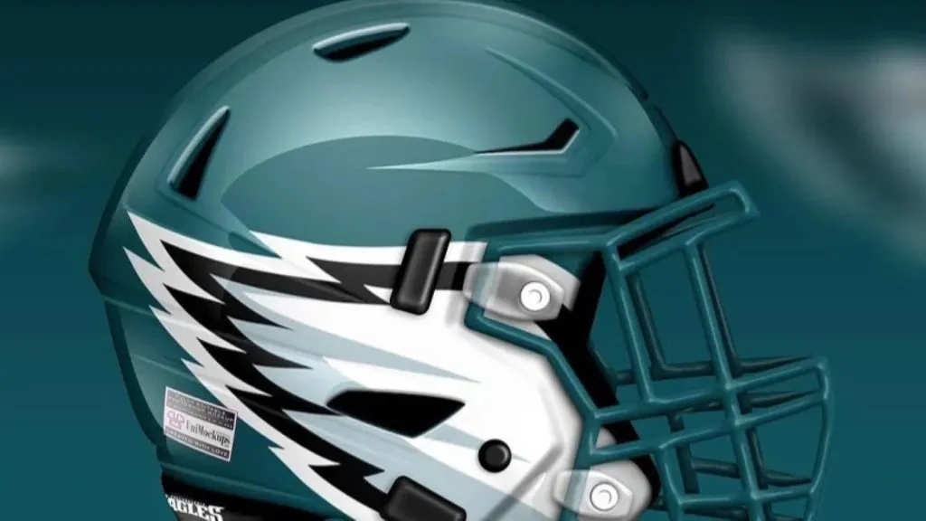
Philadelphia Eagles 1

(Instagram)
Concept 1 got a simple thing correct right off the bat. They went back to the old Kelly Green that the Eagles were known for forever. About the time the Donovan McNabb era started, they went darker with the green and ever since fans have been crying out for a return. The Eagles helmet is already great so a simple color change was all that was needed. Grade: A
Philadelphia Eagles 2
(Uni-Watch)
Concept 2 sticks with the current Eagles color palette but changes the wings. They are bigger and further down on the helmet. Admitting that no person wearing the helmet is actually a bird, it is weird that the wings appear to be coming from the wearers’ ears. Grade: C
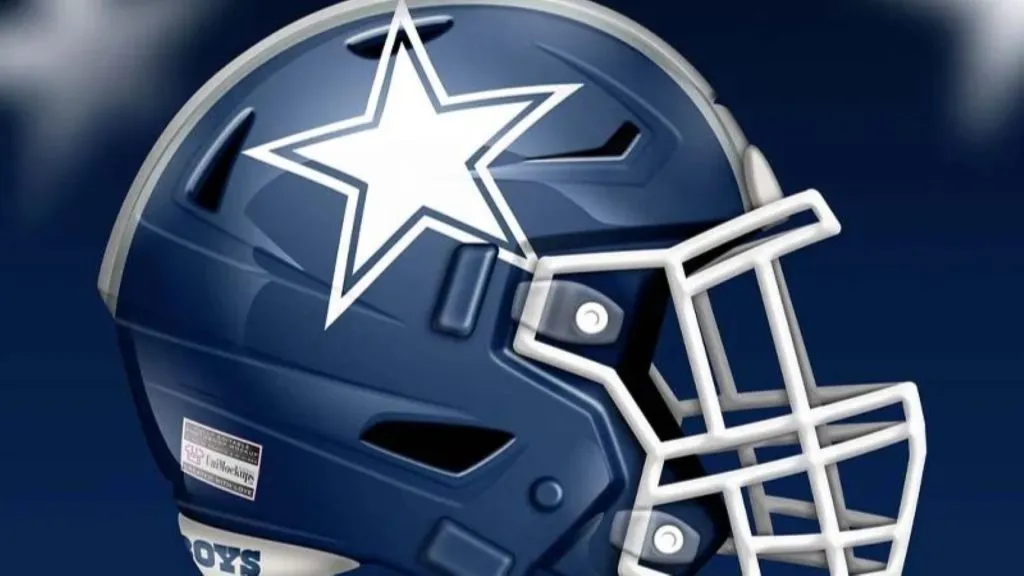
Dallas Cowboys 1

(Instagram)
Concept 1 for the Cowboys is another case of a helmet being so universally associated with a team it’s difficult to imagine a different look. It’s not a bad look, the navy helmet instead of silver. It’s not a shiny though, and you can’t imagine Jerry Jones would be a fan of that. Grade: B
Dallas Cowboys 2
(Uni-Watch)
There must not have been any other way to go for either artist than the blue helmet, because Concept 2 features an almost identical design. Again, this helmet is fine too. Unremarkable, but fine. Grade: B
Washington Commanders 1

(Instagram)
A disclaimer for both of these designs; while the football team in Washington has been renamed, the redesigns were heavily influenced by the old logo and color scheme.
Concept 1 does a nice job of avoiding the actual logo image of the franchise, but yet still is very clear about who the team is. The feathers are placed behind the forehead as they would be on a traditional Native American headdress. There is even an example of a two-tone helmet being done excellently. Grade: B+
Washington Commanders 2

(Uni-Watch)
Concept 2 has taken parts of the old logo and put them directly on the helmet. It’s a pretty neat look, albeit a little too cartoony. The yellow facemask really stands out. We wonder what it would look like with a black facemask instead. Grade: B-
Carolina Panthers 1
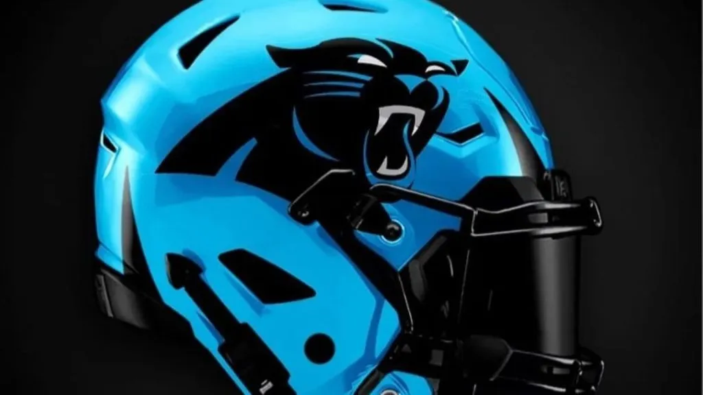
(Instagram)
Concept 1 for the Carolina Panthers is excellent. With one of the most unique and attractive color schemes in the entire league, it’s about time they made a bold decision about their uniforms. The blue helmet is striking. It’s made even better by the black logo and facemask. Grade: A
Carolina Panthers 2

(Uni-Watch)
Concept 2 also went with a blue helmet and it is very good too, just less striking as the other. Concept 2 has also added a black and silver stripe down the center of the helmet. If this exercise proves anything, it’s that the Panthers need a blue helmet immediately. Grade B+
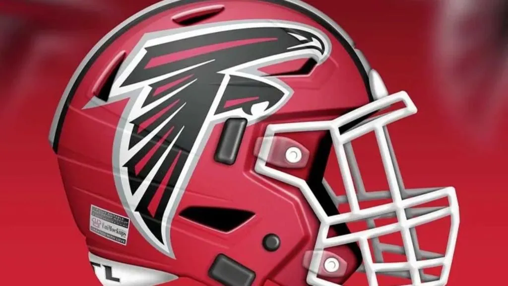
Atlanta Falcons 1

(Instagram)
Concept 1 has taken the wings of the current Falcons logo and stuck them on a red helmet. This is a really good look. The Falcons need to shift their focus away from black and towards red. This is a good start in that direction. Grade: B+
Atlanta Falcons 2
(Uni-Watch)
Concept 2 is again very similar to Concept 1 but includes the entire falcon instead fo just the wings. This is as good a time as any to let you know that the Falcons logo is a bird in the shape of the letter F. Pretty clever design. Grade: A
New Orleans Saints 1
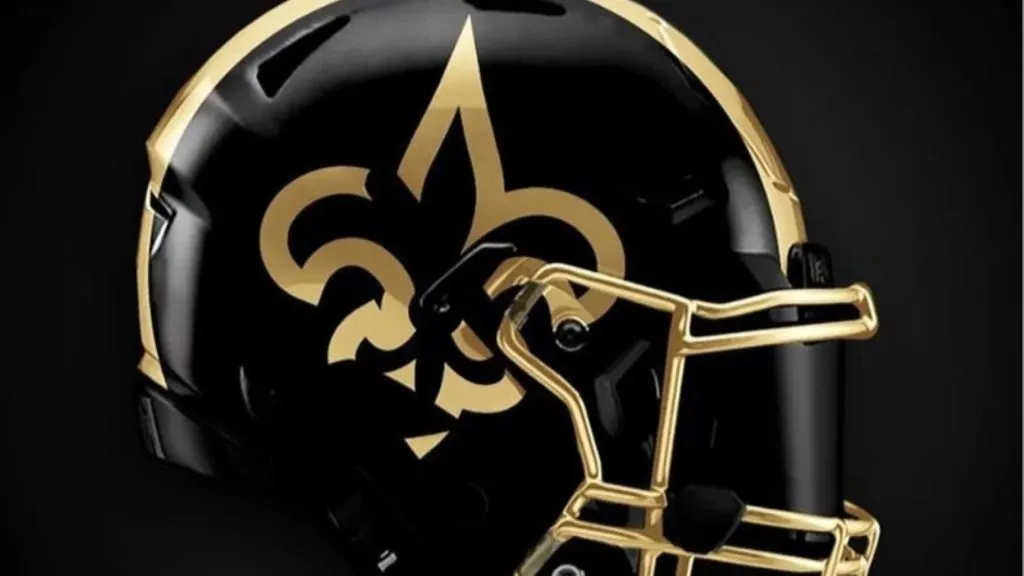
(Instagram)
Concept 1 has darkened the Saints helmet going with a black base and the outline of a gold fleur-de-lis. The gold facemask really brings this whole look together. It really stands out nicely on the black helmet. This is an excellent look. Grade: A-
New Orleans Saints 2
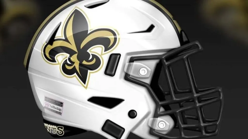
(Uni-Watch)
Concept 2 has gone in a completely different direction and has gone with a white helmet. This works really well because of the details and color differentiation on the fleur-de-lis. The gold and black helmet stripe is a nice touch too. Grade: A-
Los Angeles Rams 1

(Instagram)
Concept 1 has tried to make something decent out of the Rams’ new mess of a logo. It’s the classic rams horn design but with a modern touch. All things considered, this is a pretty decent design. It’s definitely better than what they’ve got currently. Grade: B
Los Angeles Rams 2

(Uni-Watch)
After waffling back and forth between two helmet colors for years, the Los Angeles Rams finally settled on one. The artist for Concept 2 chose to ignore that and inserted a third set of colors with this helmet. Instead of blue and white or blue and yellow, they’ve gone with blue and something their calling bone. At least they got the horn design right. Grade: B-
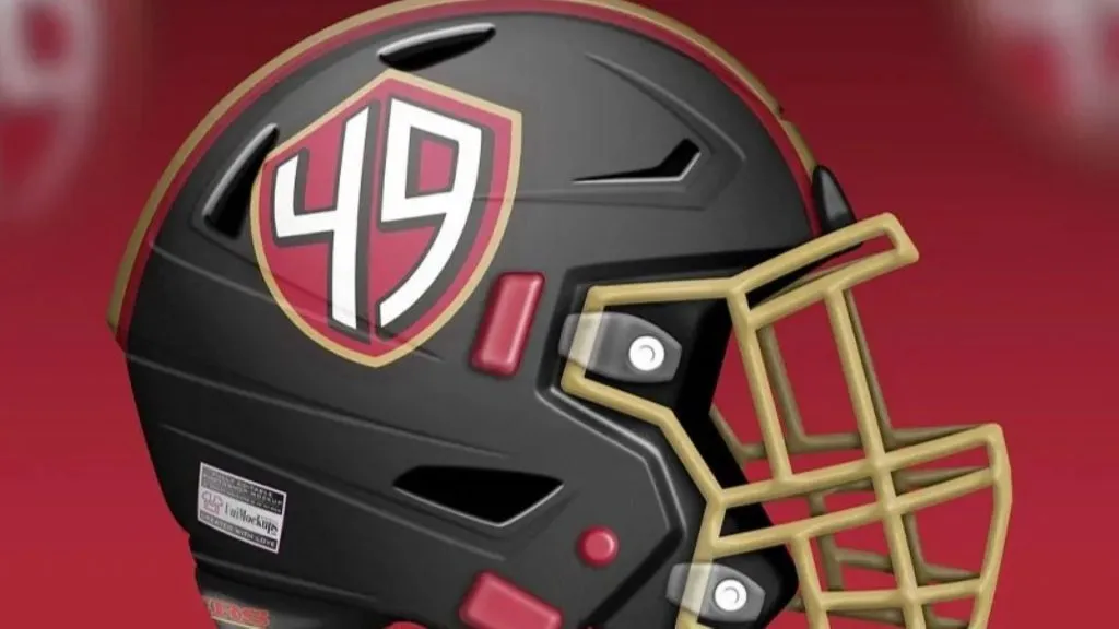
San Francisco 49ers 1
(Instagram)
Concept 1 is great because it upgrades and declutters the 49ers logo. Gone are the days of wanting or needing the oval around the SF. It just looks dated at this point. Insert this logo with the SF freed of its oval shackles and you have a much-improved look. Grade: B+
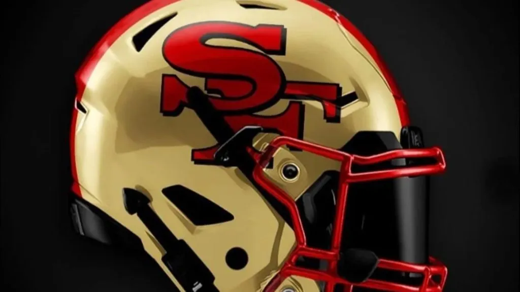
San Francisco 49ers 2
(Uni-Watch)
There’s a lot to like from Concept 2. The black helmet is good, and the accent colors go so well with black. The red and gold center stripe is particularly sharp. This helmet also features an interesting alternate logo. All in all, not a bad design. Grade: B
Seattle Seahawks 1
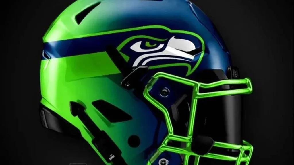
(Instagram)
Seattle has always been on the cutting edge of what’s visually acceptable on a sports uniform. Concept 1 really pushes the boundary even further. The gradient is an eyesore and the shiny facemask doesn’t match the rest of the helmet. Overall, it’s pretty bad. Grade: D
Seattle Seahawks 2

(Uni-Watch)
We have a back to the future theme with this helmet, as it’s essentially the original Seahawks helmet that they wore from the late 1970s to 2001. Bravo for bringing it back, as it’s much sleeker and classic. Grade: B+
Arizona Cardinals 1
(Instagram)
Concept 1 is similar to the Eagles helmet in that the cardinal’s wings come right out of facemask. It’s a good look. The only problem is that cardinals don’t have very long wings so the rest of the helmet is rather bare. Because the rest of the helmet is white, that bareness just looks bland. Grade: C+
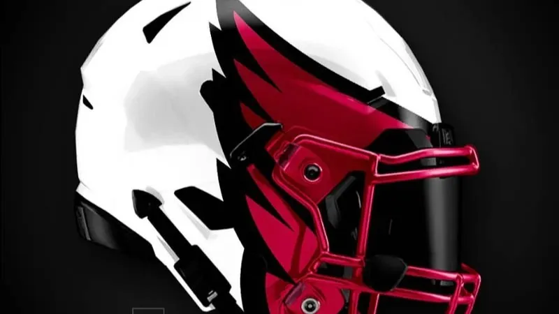
Arizona Cardinals 2

(Uni-Watch)
Concept 2 is actually the worst helmet we’ve ever seen. The only discernable feature about the helmet is the eye creeping out of an oddly shaped field of black. We can only surmise that the helmet is intended to be a closeup of a Cardinal’s face, but the execution is absolutely awful. Grade: F
Los Angeles Chargers 1
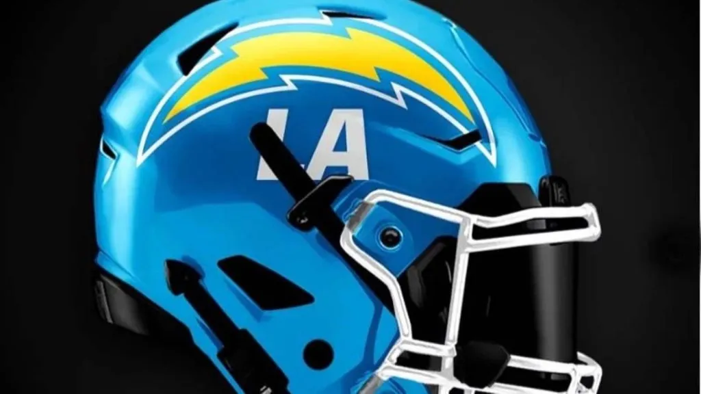
(Instagram)
The problem with any Chargers helmet or uniform redesign is that they already have the best look in all of professional sports. Concept 1 is ok. They’ve taken what works about the Charger’s look and tweaked it. We’re not a big fan of the LA underneath the bolt though. Grade: B
Los Angeles Chargers 2

(Uni-Watch)
Concept 2 has taken the classic bolt design and put it right down the center of the helmet. It’s a bold move, and we wish there was an image of the helmet from directly in front to see how it works from all angles. We can only assume then, that it’s a pretty decent look. Grade: B