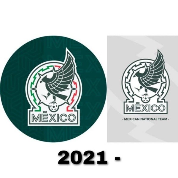
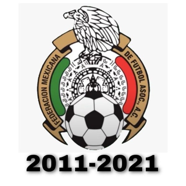
Mexico national team has played 16 times the FIFA World Cup andQatar 2022 will be its 17th. For this edition of soccer’s biggest tournement, ElTri decided to change some things, including its logo, but why?
Even though Mexico is a recurring contestant in the FIFA World Cup, its history is not the best. Outside its territory, they have been unable to advance beyond the Round of 16 and it is their greatest challenge in each edition.
For Qatar 2022 the main objective is to go through the Group stage. They will try to do it with two beautiful jerseys and with a new logo, but there is a big question around it: why did they change it?
Who designed the new Mexico national soccer team logo?

Mexico national team announced the transformation of its logo starting in 2021. They tried to get a modern shield that could represent all the topics they used in theiir previous editions.
This job was made by adidas designers, Mexico national team’s kit sponsor, who sent different options to Mexican Football Federation bosses in order to get their approval and begin to make the new shirts with this shield on them.
When and why did Mexico change its crest?

As said before, the change was revealed in 2021, but the process started years ago.Mexican Football Federation chiefs tried to give a reset and a fresh start for Qatar 2022 with a new and modern logo.
This new shield still has some similar aspects from the previous edition such as the Mexican eagle standing above a soccerball and surrounded by a circle which is divided in two colors: green and red. The white, which completes the flag, is located in the background.
A big change is that this logo is more in a minimalist style, especially the eagle. It also includes the word “México” at the bottom, something that had not been used since 1978.


