The aesthetics of sports has never been a bigger business. Teams are constantly upgrading and updating their looks to keep up with the current style. With that said, there are few better NFL offseason exercises than redesigning team helmets.
This article focuses on some of the best and worst NFL helmet designs from all over the internet. We’ve given you one of each for all 32 NFL teams and given each a grade. Flip through the slides and see if you agree. What grade would you give your team? Enjoy!
Tampa Bay Buccaneers: Best Design

(Uni-Watch)
The only way this redesign would have been outdone is by putting an entire pirate ship plus the old Bucco Bruce logo on the helmet. That’s exactly what has happened with Concept 2. Plus, the Bucs are best known for having a replica pirate ship at their stadium. Why not just steer into the skid?
The bottom line is that this helmet is without peers in this group. It’s a masterpiece. We’ll start the petition now to get the current and future generations of Buccaneers players wearing this helmet.
Grade: A+
Tampa Bay Buccaneers: Worst Design

(Paul Bunyan Design)
The garnet helmet looks like images you’d see from the Hubble telescope of a galaxy far away. It’s kind of cool to look at but then you remember it’s a football helmet and the fact that pirates have nothing to do with outer space. It’s a good example of mixing genres not making a lot of sense.
Why does the helmet look like this? Only Paul Bunyan Designs knows the answer to that. There’s just too much going on with this helmet. Whatever happened to just keeping it simple?
Grade: C
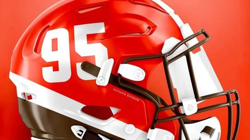
Kansas City Chiefs: Best Design
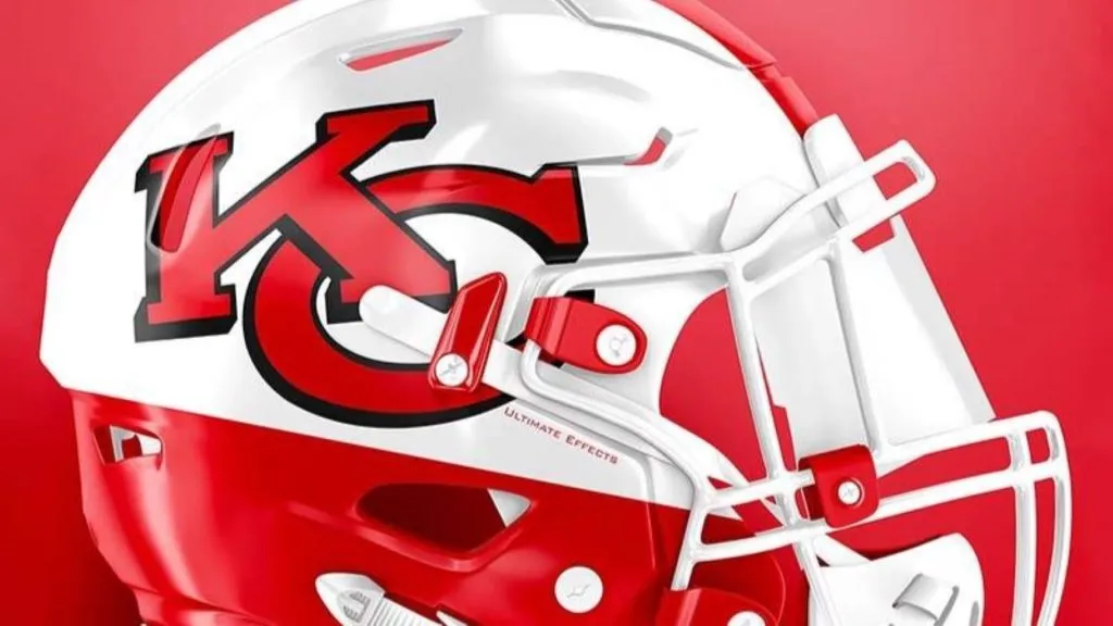
(Ultimate Effects)
The Chiefs are another team like the Browns and Packers that have classic helmets that teams are hesitant to mess with. After all, history is important, especially for franchises like the Chiefs. With teams like this, you don’t want to reinvent the wheel.
But what’s nice about this upgrade is that it’s subtle but effective. This upgrade brings Kansas City’s helmet into the 21st century without making radical changes. The Chiefs surely wanted to avoid doing anything drastic the way the Seahawks did with their bright green color scheme.
Grade: B+
Kansas City Chiefs: Worst Design

(Uni-Watch)
This concept has stuck with the original design with some slight but damaging changes. What has happened to the Chiefs logo? It looks similar but somehow glaringly different, almost as if it is a balloon that has come unknotted and is deflating midflight.
Something just doesn’t look right here. If the Chiefs were going to do something like this, they might as well keep what they currently have. Either do something bold and different or don’t do anything. Subtly gets you nowhere when you already have one of the league’s classic helmets.
Grade: C
Buffalo Bills: Best Design
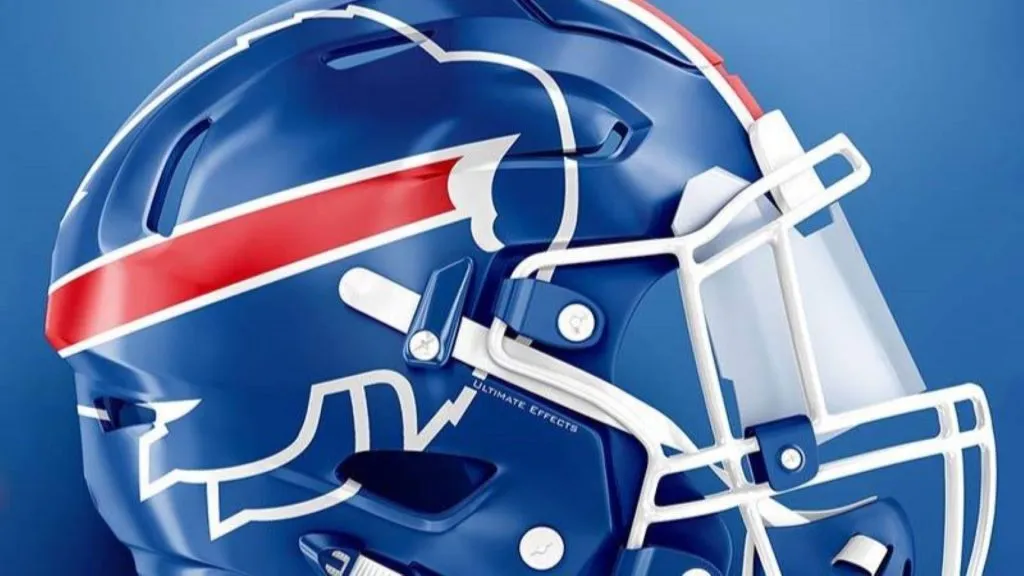
(Ultimate Effects)
What’s nice about this helmet is that it’s taken what’s good about Buffalo’s current look and modified it. Essentially it’s just taken a beautiful white helmet with a charging buffalo on the side and made it blue instead.
Keeping the logo is a big deal, and this helmet just makes that logo bigger. In a way, the charging buffalo just becomes more intimidating. The current white helmet is perfect, so there’s no need to change. But if the Bills wanted to change, this would be a good look.
Grade: A
Buffalo Bills: Worst Design

(Uni-Watch)
Nope, don’t like it. There’s absolutely nothing to like about this helmet. Members of Bills Mafia might riot if the team actually had to wear this helmet. We can’t even recognize this as being Buffalo’s helmet without the charging buffalo.
This concept has taken the idea of minimalism to an unhealthy level. Sure, that stripe is the stripe coming off the buffalo in the Bills logo, but where’s the buffalo? The buffalo is bringing the energy, hence the stripe. But if he isn’t there, there can be no stripe. It’s all wrong and it makes no sense.
Grade: F
Miami Dolphins: Best Design
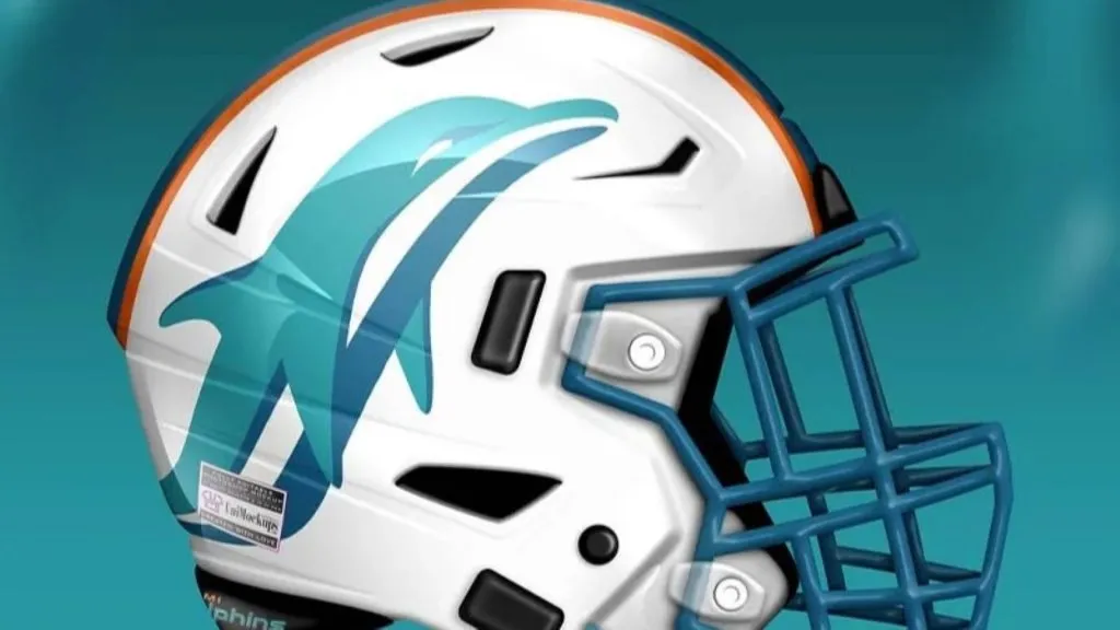
(Uni-Watch)
This concept gets it right. It’s simple, put a big dolphin on a white helmet with teal and orange stripes. It’s an update on the classic look the team has worn forever. It’s well done without trying to get too crazy or get away from what works.
The only way this could be better is if the Dolphin was wearing a helmet, like in the original logo. We also think that just a little more splash of color could serve this helmet well.
Grade: A-
Miami Dolphins: Worst Design
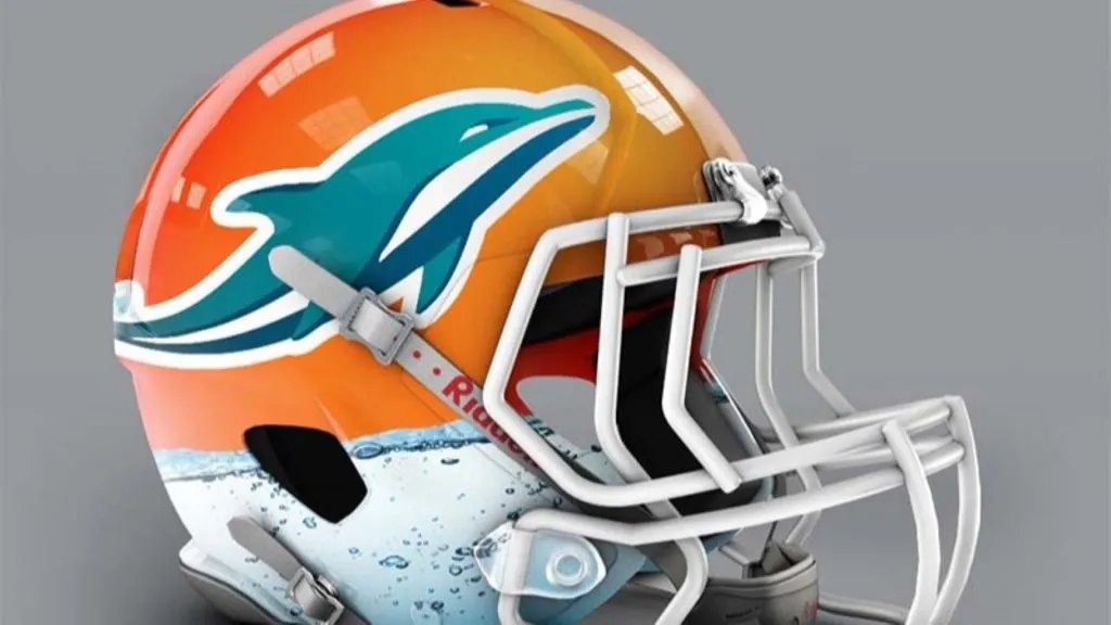
(Paul Bunyan Design)
On the other hand, this helmet has arguably too much color. If this was just an orange helmet with a slim blue dolphin on the side we might have something here. But the designer put what appears to be a stock image of tap water on the bottom of the helmet.
Aside from the fact that that looks so tacky and cheap, the designer didn’t even bother to put the dolphin in the water. It’s a levitating dolphin. The water on the helmet is an interesting look, but at least put the dolphin’s tail in the water, right?
Grade: D
New England Patriots: Best Design

(Uni-Watch)
This concept is brilliant. This is a helmet. It’s everything that fans should think about when they think about New England or the Patriots. In fact, it’d be hard to find a helmet that’s more true to a team’s nickname than this one.
Patriot Pat is big and bold. The white helmet is fresh, especially with the red facemask. This is the perfect use of red, white, and blue throughout the entire helmet. Isn’t that exactly what you want from the New England Patriots?
Grade: A-
New England Patriots: Worst Design

(Instagram)
The concept is a mixed bag. There are things to like here, including the blue helmet, the chrome red facemask, and even the stripes. After all, we appreciate the effort to incorporate red, white, and blue on New England’s helmet.
The problem is those all look good individually, but together they clash. There’s too much going on with the blue looking too bold right next to the stripes. The mixture of the colors also tends to take the attention away from the classic Patriot Pat logo, which isn’t what you want to do.
Grade: C-
New York Jets: Best Design

(Uni-Watch)
This concept really nails it. The logo is clear and stands out. There’s clearly a jet on top of the NYJ logo, which is a wonderful touch since a lot of fans may forget what the Jets indicate.
At the same time, the helmet introduces that seafoam green that has worked so well up in Seattle. The Jets are already the second team in New York, so why not try something that’s already working for someone else? They’ve got nothing to lose, and if the Jets are going to lose, they might as well look good.
Grade: B+
New York Jets: Worst Design

(Paul Bunyan Design)
Military imagery on sports uniforms walks a thin line between pandering and being respectful. In reality, the service academies should usually be the only ones that try to do this with their helmets or uniforms. At the pro level, it’s probably not going to be a good look.
In this case, this helmet looks bad. We get what they’re trying to do here; it’s a pilot’s helmet. But it just doesn’t work and looks rather ugly, especially since there isn’t a ton of color to it.
Grade: D
Pittsburgh Steelers: Best Design
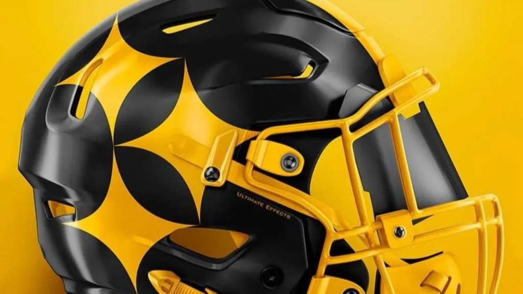
(Ultimate Effects)
This may be a controversial pick because it eliminates the colors from the steel badge on the side of the helmet, but the designer is limited in what is possible given that the badge almost has to be included on the helmet.
Going with just two colors is a neat way to pull this off. In fact, this would look good with a Steelers “Color Rush” jersey. After all, the Steelers are best known for being black and gold, so why not double down on that look?
Grade: B+
Pittsburgh Steelers: Worst Design
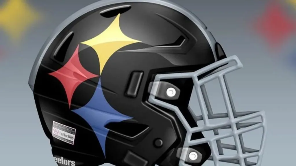
(Uni-Watch)
Oh boy. This concept goes hard into the Steelers logo. Sure it’s unique to the Steelers’ identity as it is the logo belonging to the American Iron and Steel Institute, and is known as the Steelmark. But this helmet takes things a little too far.
The problem is without the rest of the logo it looks like the face paint of a court jester. And nobody wants to be a jester. The Steelers are too proud of a franchise and Pittsburgh is too proud of a city to have a helmet like this.
Grade: C
Baltimore Ravens: Best Design
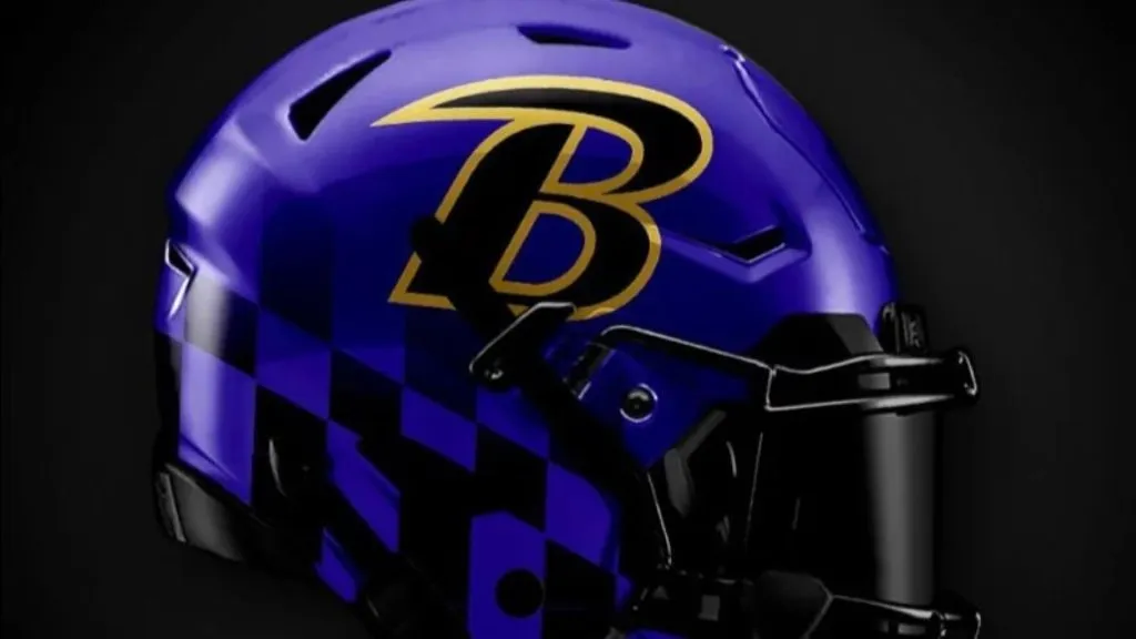
(Instagram)
This concept is excellent. Gone is that weird bird, thankfully. The stylized B is cool, but the real winner here is the Maryland state flag pattern that is subtlety and menacingly lingering at the bottom of the helmet.
Put a black facemask on this bad boy and you’ve got yourself the instrument of a modern-day gladiator. Honestly, this helmet couldn’t get much better. The black and purple work particularly well for an NFL team that has a strong defense, which has been Baltimore’s calling card throughout much of the team’s history, making this the perfect helmet for the Ravens.
Grade: A
Baltimore Ravens: Worst Design
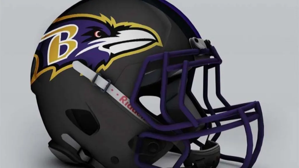
(Paul Bunyan Design)
With respect to the designer, this is awful and boring all around. The helmet is too dark, it’s nearly impossible to tell that the facemask is purple. Why even bother making the facemask purple?
Then they simply stuck the existing raven head logo on the helmet and called it a day. It’s a lazy design that doesn’t even try to do something inventive or creative. Plus, the bird logo looks weird against the all-black helmet. It’s not cool or intimidating at all, making this helmet design a complete failure.
Grade: F
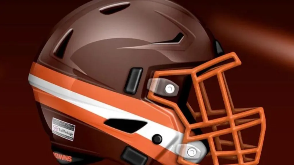
Cleveland Browns: Best Design
(Ultimate Effects)
If you have to update a classically perfect helmet like the Browns, this is how to do it. The helmet remains simple with a few colored stripes at the bottom that add some much-needed color to the design.
But the designer cleverly adds a bit of old-fashioned football into the helmet. Adding the numbers on the side harkens back to the football of yesteryear, which helps to keep Cleveland’s “vintage” aesthetic intact. It’s just different enough from the current version to work without upsetting too many fans.
Grade: B+
Cleveland Browns: Worst Design
(Uni-Watch)
We’re going to stop you right here, Browns helmet no. 2. The helmet stripes go down the middle of the helmet, not from the back of the head to the jawline.
For what it’s worth, any helmet redesign for the Browns that doesn’t feature Brownie the Elf is missing an obvious home run. But this design is barely an upgrade. We know that the team is called the Browns. But this helmet needs more orange and white and less dark brown for its color scheme.
Grade: C-
Cincinnati Bengals: Best Design
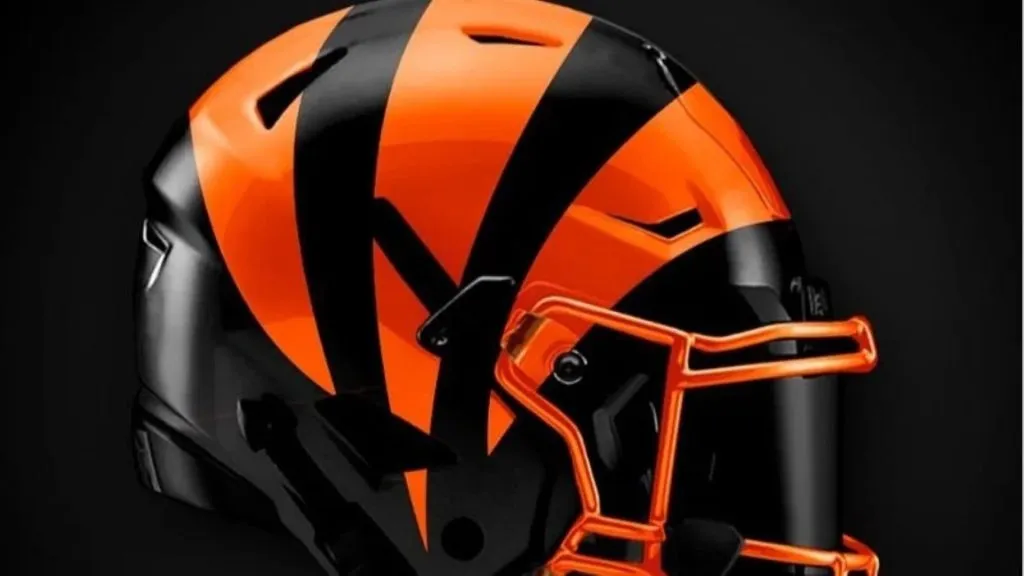
(Instagram)
They didn’t have to do much to make this concept a winner. The helmet looks darker and more menacing compared to the current design. Essentially, they took an orange helmet with black stripes and made it a black helmet with orange stripes.
The change is subtle but powerful, making this an impressive look. Keep in mind that the Bengals like to call their home stadium The Jungle. We’re definitely getting more jungle and more intimidating vibes coming off of this helmet.
Grade: A
Cincinnati Bengals: Worst Design
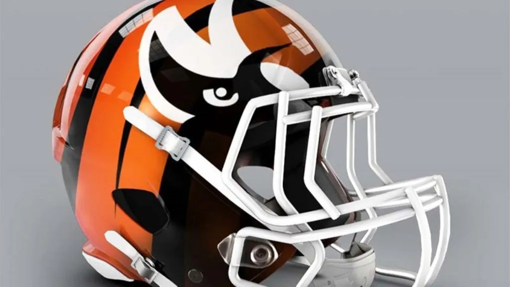
(Paul Bunyan Design)
Honestly, what is going on here? Have they really tried to put the eyes of a Bengal tiger on the crown of the helmet? That’s an absolutely ridiculous idea.
Frankly, it almost looks more like the head of the Arizona Cardinals’ logo than a Bengal. If only we could get a head-on view to see exactly how ridiculous it would be. This is definitely a case of trying too hard to make something happen but just sourcing up the existing design is a much better option.
Grade: F
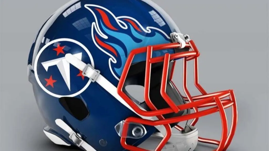
Tennessee Titans: Best Design

(Instagram)
This redesign for the Titans has to be one of the finest redesigns in the entire set. The original Titans/Oilers colored flames coming off the facemask look awesome.
The fact that the facemask is light blue shows an attention to detail that is unmatched. This helmet gets all of the team’s colors in there with a cool look that fans are going to love. It’s a shame that football fans don’t wear replica helmets the way baseball fans wear ballcaps because these would sell like hotcakes.
Grade: A+
Tennessee Titans: Worst Design
(Paul Bunyan Design)
Picture the head-on view of this helmet. We have to assume there’s the same exact design on the other side. What this ends up looking like from the front is that the player wearing the helmet has flaming blue eyebrows.
That’s probably not the look you want to have during a football game. After all, this is a sporting event, not a circus. We’re also not crazy about the “T” within the circle that’s surrounded by stars. It doesn’t add much to an already problematic design.
Grade: D
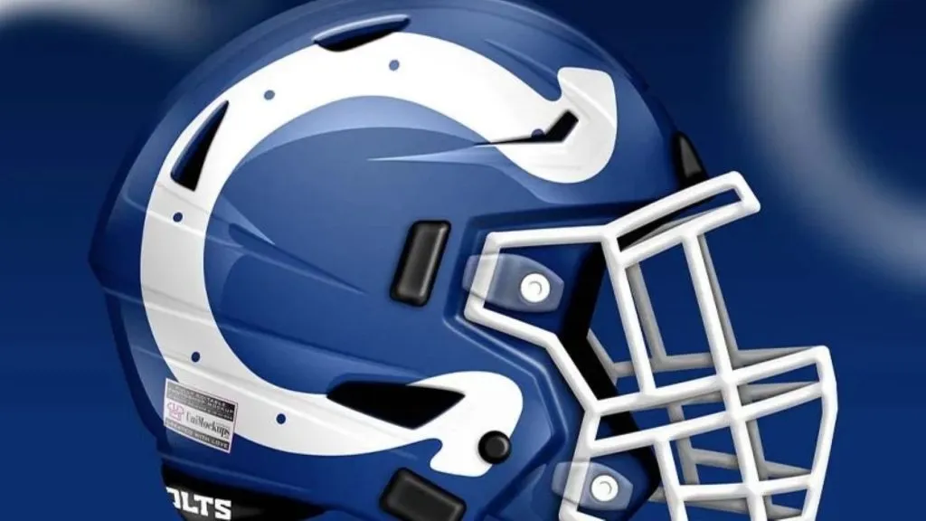
Indianapolis Colts: Best Design
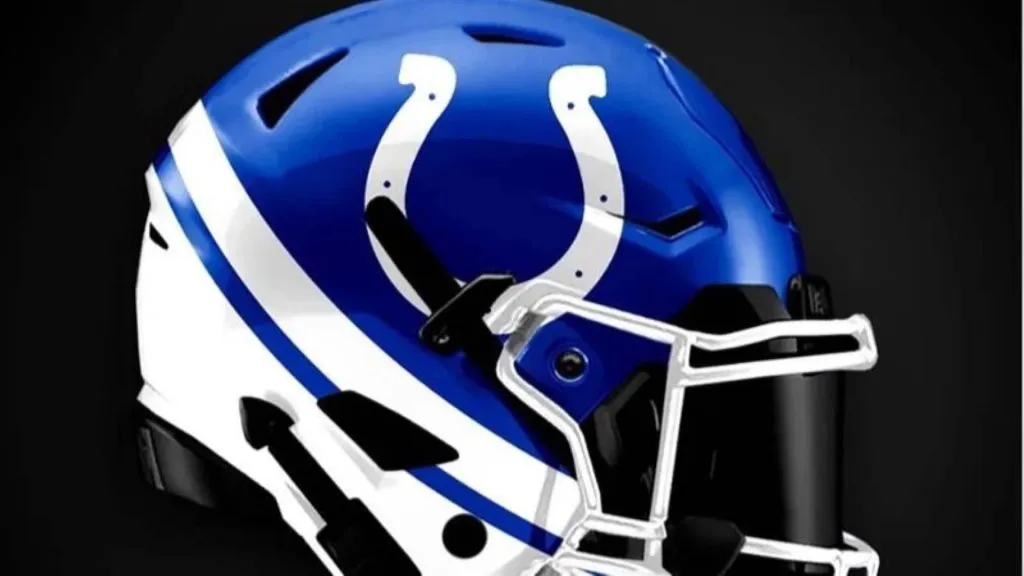
(Instagram)
The Colts have one of the most traditional looks in all of football, so it’s nice to see the modern touches put on the helmet in this concept. The white stripes really pop and give a classic look a much-needed update without taking away what fans will recognize.
With this update, we get a little more color, which is nice because Indy’s blue and white mesh so well together. Plus, the horseshoe has become synonymous with the Colts, so there’s no reason to mess with that.
Grade: B
Indianapolis Colts: Worst Design
(Uni-Watch)
The artist tried too hard with this one. Yes, when you turn a horseshoe on its side it looks like a “C” for Colts. And yes, the horseshoe fits better on the helmet turned like that. But it doesn’t make much sense to turn it like that.
The horseshoe isn’t meant to be facing in that direction. It’s too much of a change from the look fans know well. Instead of looking like the Colts, this helmet looks like the Rams changed their primary color from yellow to blue. That’s probably now what the Colts want to look like.
Grade: C
Houston Texans: Best Design
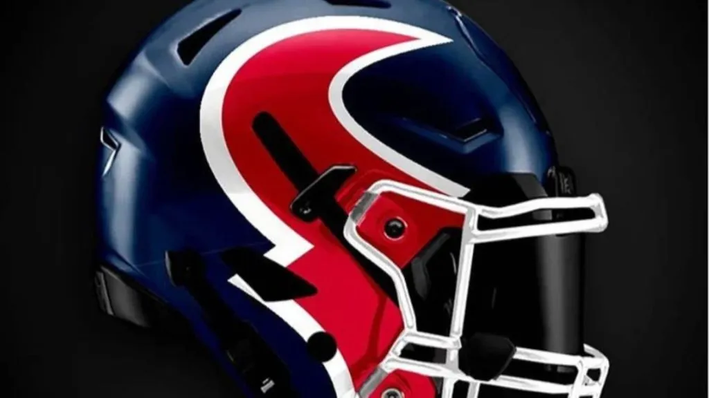
(Instagram)
For this concept, the artist has taken the logo and put half of it on either side of the helmet, making it look like you’re looking into the face of the bull. That’s a cool look. Remember, the Texans are a young franchise compared to the rest of the league, so they should look hip and cool.
The only downside is the white facemask. It takes away from the bold colors on the rest of the helmet that make it pop. Change the facemask to a darker color and we’d have something special.
Grade: B+
Houston Texans: Worst Design

(Uni-Watch)
To the designers of this concept, we have just one question: Where’s the other half of the logo? On the helmet, we only see the blue half. Where’s the rest?
Another problem we find with this helmet is that there’s too much red. It overpowers the blue and white, especially the nice star in the middle to represent Texas as the Lone Star State. This design is definitely a case of overthinking it and trying to do too much. This needs to be simplified to create a viable helmet design.
Grade: D
Jacksonville Jaguars: Best Design
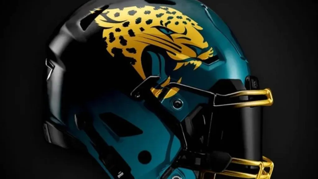
(Instagram)
This concept has the Jaguars going back to the two-tone look that they tried out a few years ago. The upgrade here is the teal fades to black and not black to gold. The two-tone face mask is cool too.
Also, check out the jaguar on the side. That looks sharp and fierce and blends in perfectly well with the black and teal around it. Obviously, jaguars are super cool in the first place, but this design really makes the jaguar pop. Just look at the teal tongue and eyes!
Grade: B+
Jacksonville Jaguars: Worst Design
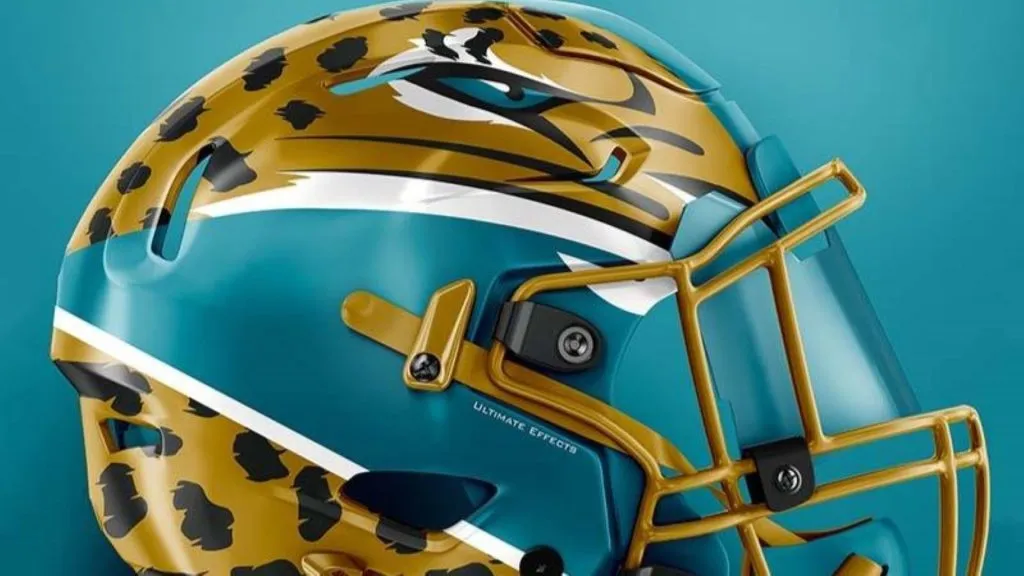
(Ultimate Effects)
Seriously, what’s going on here? This helmet may have actually been pretty cool if they had only used the Jaguar pattern along the bottom of the helmet and put some sort of design on the top, like numbers or a “J” for Jaguars and Jacksonville.
But this just looks bizarre. Almost like the jaguar has dislocated its jaw in order to eat something really large. The whole center of the cat’s face is missing. The eye itself looks cool, but that doesn’t do enough to change how awkward it looks. The massive amount of teal on this design isn’t helping either.
Grade: D+
Las Vegas Raiders: Best Design

(Instagram)
The Raiders have such a solid and classic look it’s tough to improve on it. But this concept has somehow found a way to do that. The key was to throw the Raider logo on a black helmet instead of a silver one.
It’s a simple change, but it’s one that looks so much better. Given the team’s recent move to Las Vegas and their new stadium, which is literally nicknamed The Death Star, this is the perfect helmet change. Just steer into the skid and embrace the dark side, right?
Grade: A
Las Vegas Raiders: Worst Design
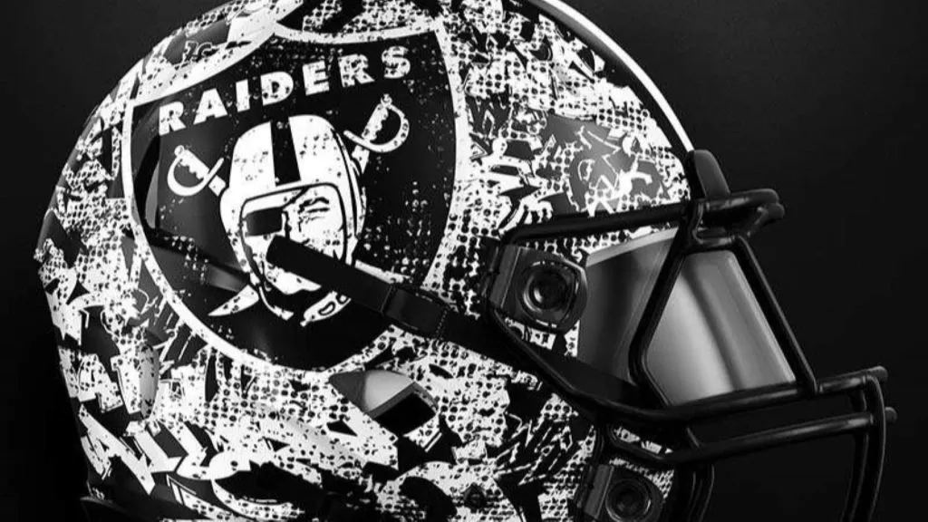
(Ultimate Effects)
We have genuine questions about what is on this helmet. Seriously, what is that pattern supposed to be? Are they trying to turn their helmet into an artsy-looking mosaic? Perhaps that’s not the look you want for an NFL helmet.
It’s unintelligible and grating on the eyes. Perhaps the thinking was that if the classic logo is in the middle of everything, the rest doesn’t matter. But this helmet proves that’s not the case. The rest of the helmet matters too, not just the logo in the middle.
Grade: D
Los Angeles Chargers: Best Design
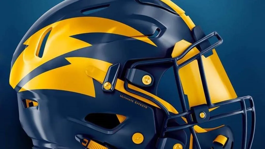
(Ultimate Effects)
This is one of the best helmets in the entire set. The Chargers have the best uniforms and helmets in pro sports, which makes it tough to create a helmet to match that. But we think that this does a good job.
The color scheme has changed a bit and gone darker. But the colors look strong and sharp, which makes this work. The bolts have a bit more of an artistic flair to them and aren’t so Microsoft Paint, which also helps this design gain our approval.
Grade: A
Los Angeles Chargers: Worst Design
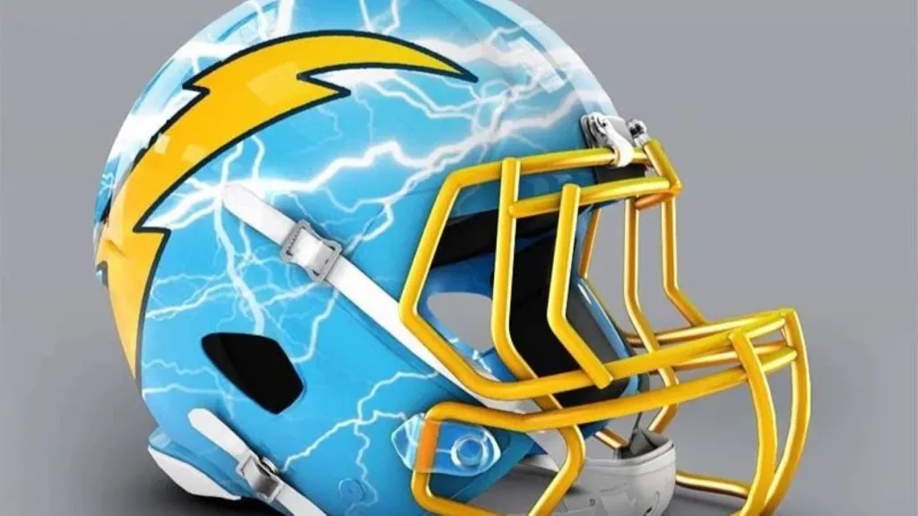
(Paul Bunyan Design)
From one excellent helmet that does away with amateur lightning bolts to a helmet that adds more amateur lightning bolts. This helmet is astonishingly stupid. It tries way too hard to turn the lightning bolt into a weather motif. That’s just not what you expect from an NFL helmet.
If the helmet has a giant lightning bolt adorning each side of the helmet, why do you need to put different-looking lightning bolts all over the thing? It’s doing too much of the same thing rather than either keeping it simple or being brave and trying something new.
Grade: F
Denver Broncos: Best Design
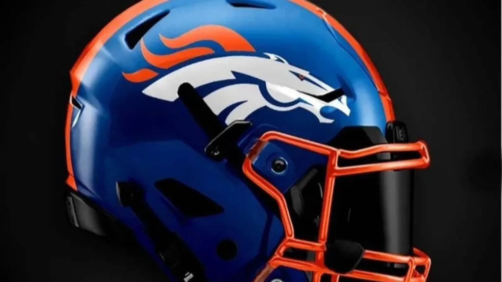
(Instagram)
It seems like every time there is a Broncos helmet update, the artist incorporates the light blue from the Orange Crush days of the Broncos. Let’s be honest, who didn’t love those old jerseys? The orange was amazing and always needs to be part of Denver’s color scheme.
What has happened with this concept is the merger of the two helmets. The color scheme combines Orange Crush with the modern Broncos logo. Granted, it doesn’t reinvent the wheel, but it sticks with something they know will work.
Grade: C+
Denver Broncos: Worst Design
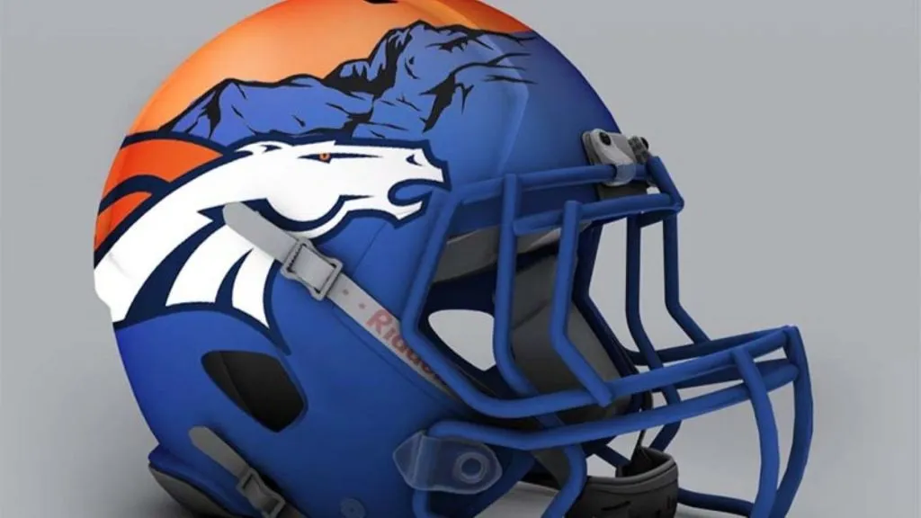
(Paul Bunyan Design)
Instead of staying simple, this design tries to be too fancy and try too hard. The designer needed to stick with one gimmick on this helmet. Either go with horses or go with the mountains. Doing both at the same time is too hard.
Yes, Denver is surrounded by the Rocky Mountains, but that has nothing to do with horses. The way the orange sky mixes with the Bronco logo is no good. If you took the logo away and put this on a poster, we’d be on board. But this isn’t a good look for an NFL team’s helmet.
Grade: D+
Washington Commanders: Best Design
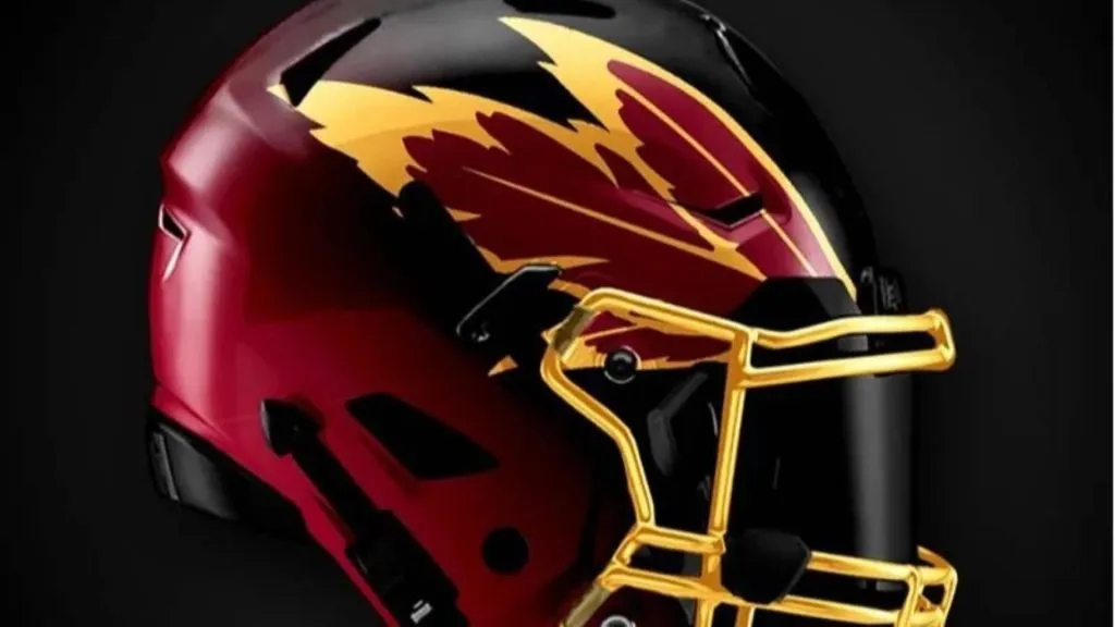
(Instagram)
This concept does a nice job of avoiding the actual logo image of the Redskins franchise. Before they changed their name, this would have been the least the franchise could do about its controversial name.
The problem is they didn’t do enough to stay away from the team’s name. The feathers are placed behind the forehead as they would be on a traditional Native American headdress. But if you can put that on the back burner and just look at the aesthetics of this helmet, it looks good.
Grade: B+
Washington Commanders: Worst Design
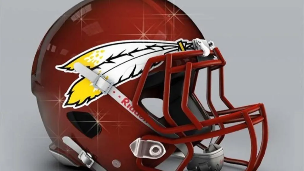
(Paul Bunyan Design)
Is anyone else getting a migraine just from looking at this helmet? Why does it have to look so shiny? That can’t be done on purpose, right? At least it shouldn’t be. Why would anyone sign off on putting sparkles over the top of this image?
The issues with indigenous imagery aside, this is an overall terrible helmet. The small set of feathers on the helmet is dwarfed by the rest of the maroon dome. It looks sad. The Commanders should count themselves lucky that they no longer have to fear wearing such a helmet during games.
Grade: C-
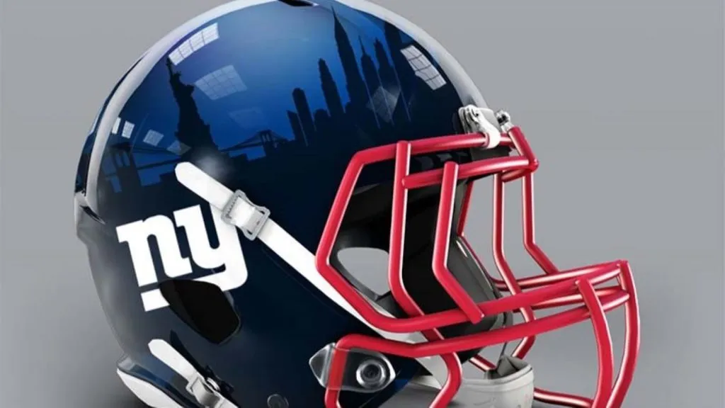
New York Giants: Best Design

(Instagram)
It’s almost hard to imagine the Giants wearing an alternative helmet to what they currently wear. But this isn’t such a terrible idea. This concept with the bottom stripes is back and this time we are all about it.
The colors do all the work here. Maybe it’s just the inherent patriotism of a red, white, and blue helmet but the look is terrific. The Giants have waffled between essentially the same two bland helmet designs for decades. This would be a welcome upgrade.
Grade: A-
New York Giants: Worst Design
(Paul Bunyan Design)
People need to stop putting skylines on helmets. It doesn’t look nearly as cool as you think it does. It always sounds good in theory, but it’s hard to make it work. Just look at this one; you can barely see the NYC landmarks because it’s so dark.
Also, the NY logo is far too small. These are the Giants, after all. Plus, the NFL is a television sport. You won’t be able to see any of these details on the screen, much less sitting in the upper deck.
Grade: D+
Dallas Cowboys: Best Design
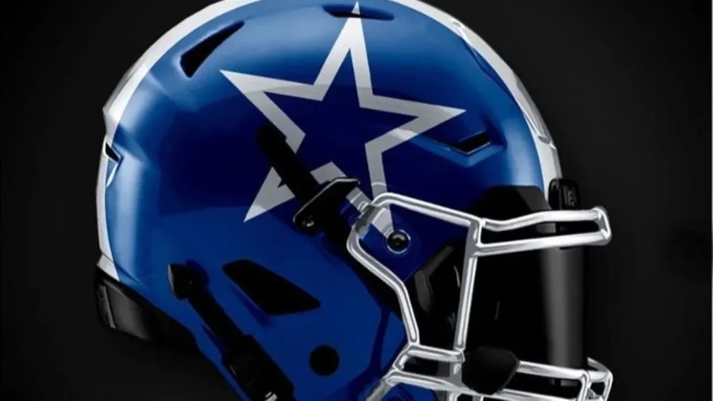
(Instagram)
This concept for the Cowboys is another case of a helmet being so universally associated with a team that it becomes difficult to imagine a different look. Let’s face it, the current Dallas look is classic and will never go out of style.
That being said, this isn’t a bad look. The navy-colored helmet instead of silver isn’t a terrible change if you had to change it. The problem is it’s not shiny, which goes against what the Cowboys try to represent.
Grade: B
Dallas Cowboys: Worst Design
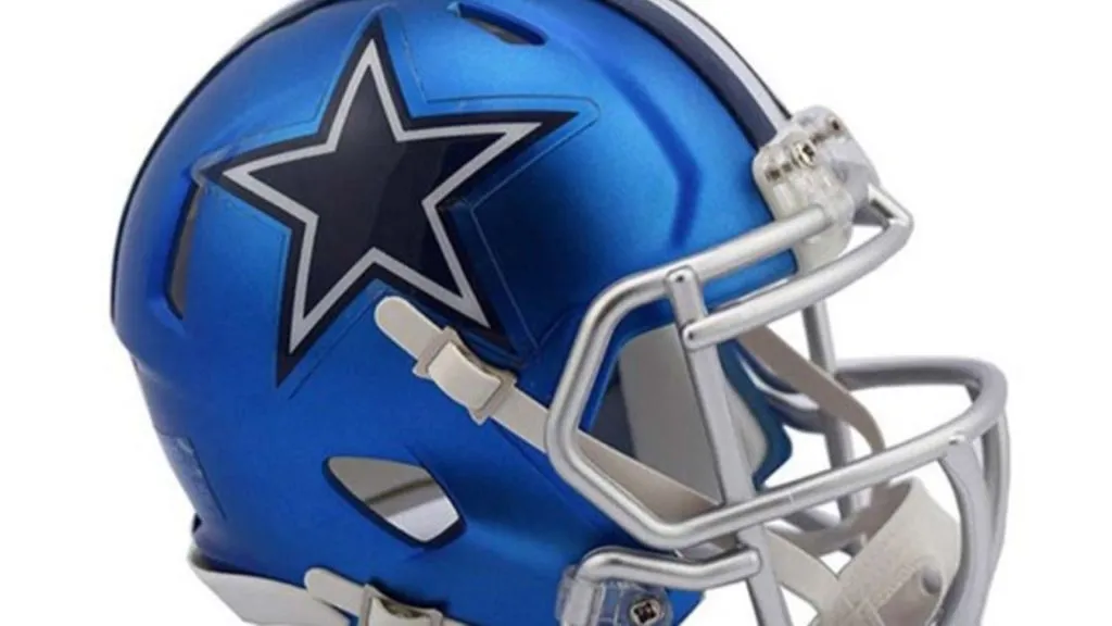
(Dallas Cowboys | Pinterest)
You could argue that this helmet and the helmet above it are similar. However, the thing that this helmet does wrong is an attempt to copy the color of the Cowboys’ pants. The helmet and the pants should never be a perfect match for one another.
Granted, it remains a mystery why the Cowboys wear that weird shade of blue. Whatever the reason, nobody should try to copy that, which is why this helmet is a bad idea and why we have put it into the worst category.
Grade: C
Philadelphia Eagles: Best Design
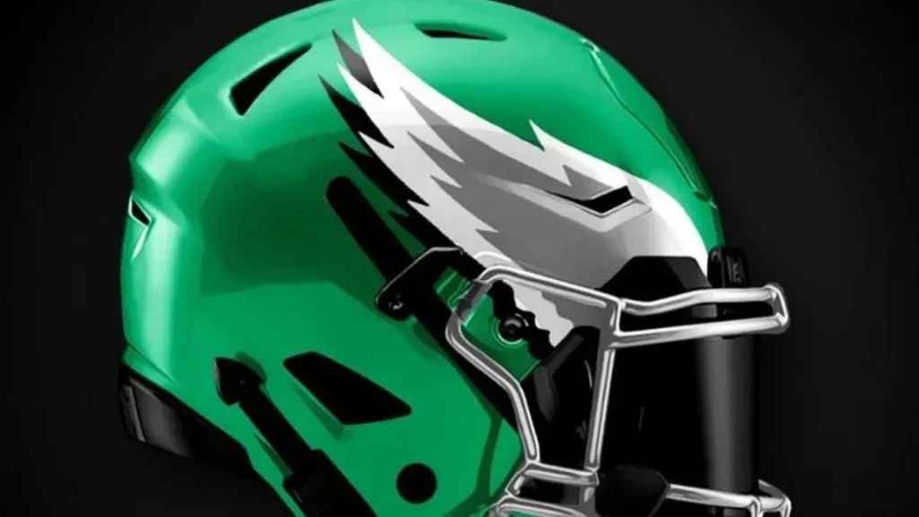
(Instagram)
This concept got a simple thing correct right off the bat. They went back to the old Kelly Green that the Eagles were known for forever. In fact, this helmet is reminiscent of the jerseys and helmets the Eagles wore a few decades ago, which was a classic look.
About the time the Donovan McNabb era started, they went darker with the green. Ever since then, fans have been crying out for a return. The Eagles helmet is already great so a simple color change was all that was needed. Remember, there’s nothing wrong with a vintage look.
Grade: A
Philadelphia Eagles: Worst Design

(Paul Bunyan Design)
The scallop design underneath the wings is supposed to be bird feathers, right? That’s the assumption we’re going to make with this design. But is anyone else unsettled by them? There’s just something that doesn’t look right.
The green color makes them look like snakeskin or the skin of an alligator. It’s almost like they’re going for a 3D look but failed to pull it off. The bottom line is there is something about this helmet that is making us uncomfortable. We can’t imagine Eagles fans being on board with it either.
Grade: C-
Green Bay Packers: Best Design
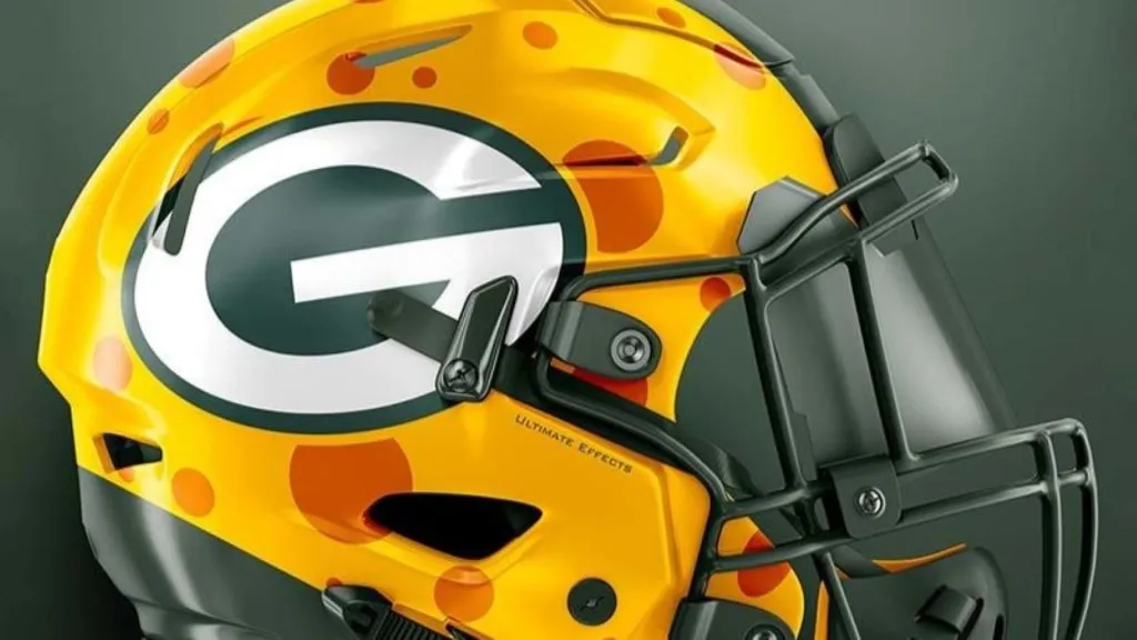
(Ultimate Effects)
Will the Packers ever wear a helmet that looks like this? We can only hope that day never comes. Is it the best possible redesign of the Green Bay Packers helmet? Probably not. But is it the most fun? Absolutely. They’ve combined the famous cheeseheads that fans wear with an actual helmet.
The NFL is a fun-sucker when it comes to equipment and uniforms, which is why this would probably never happen. But even if this isn’t your cup of tea, it sure would be fun for the Packers to pull these on for one game every year.
Grade: A
Green Bay Packers: Worst Design

(Instagram)
The Packers are another team with a helmet that’s hard to improve on and not commit sacrilege by updating. The one we like is more kooky and creative than realistic, something you want to try once in a while.
But this design makes it seem like someone seriously thinks the Packers should wear this. However, the mix of colors looks weird. A franchise like the Packers needs to have a simple and classic look, not fool around with different patterns just for the sake of doing something different.
Grade: C+
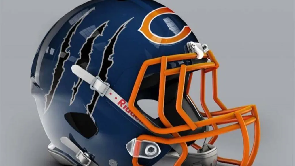
Chicago Bears: Best Design

(Instagram)
There isn’t that much that’s different from the standard-issue Bears helmet compared to this design. In a lot of ways, that’s what we like about it. The Bears are such an old team that it feels wrong to try to change what fans have expected to see for decades.
Naturally, we like this one because it’s similar to what’s already there. The main difference is the pop of orange on the facemask and the helmet stripe. It’s a really sharp update. The additions bring this helmet into the 21st century without ruining the classic design.
Grade: B+
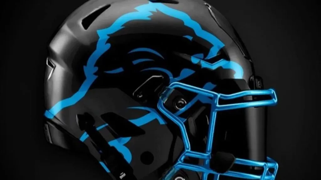
Chicago Bears: Worst Design
(Paul Bunyan Design)
The Chicago C on the crown of the helmet has the potential to be an interesting design change if the rest of the helmet looks good. Granted, it would take some getting used to. But it does have potential.
Unfortunately, the rest of the helmet takes away from that simple design change. The claw marks on the side are just tacky. It looks like something the Oregon Ducks would wear just to draw attention to themselves. That’s not what a historic franchise like the Bears is all about.
Grade: D+
Minnesota Vikings: Best Design
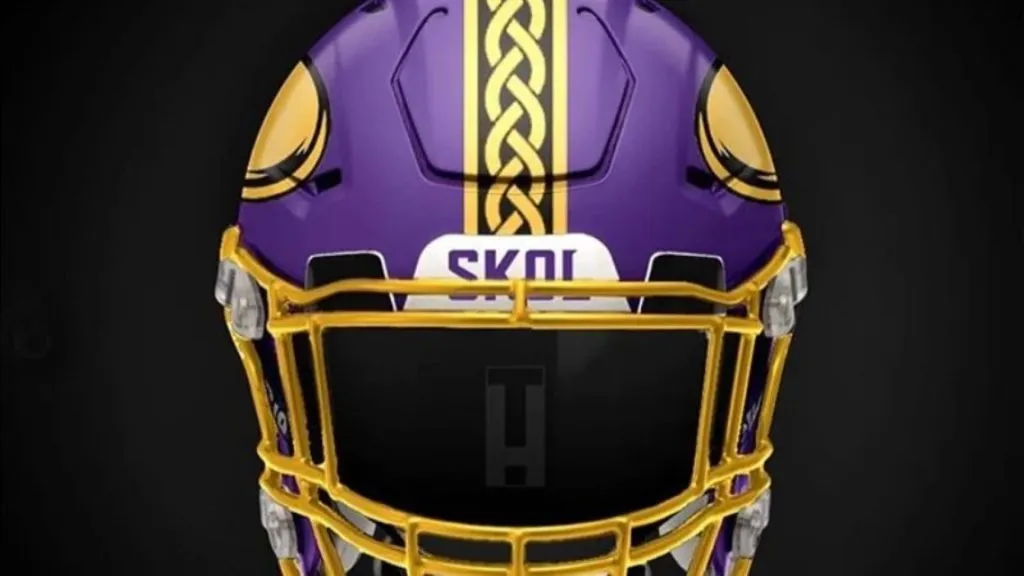
(Instagram)
At first glance, this concept looks similar to the current Vikes helmet. The artist has prioritized gold in favor of white, but that’s pretty much it. What takes this helmet to the next level is the Viking braid down the center stripe on the helmet.
That is an incredible addition that should be added to the current Vikings helmet immediately. With their new stadium, the team has embraced the Nordic roots that come with its team name. This would be a way to incorporate that with the team’s helmet.
Grade: A
Minnesota Vikings: Worst Design
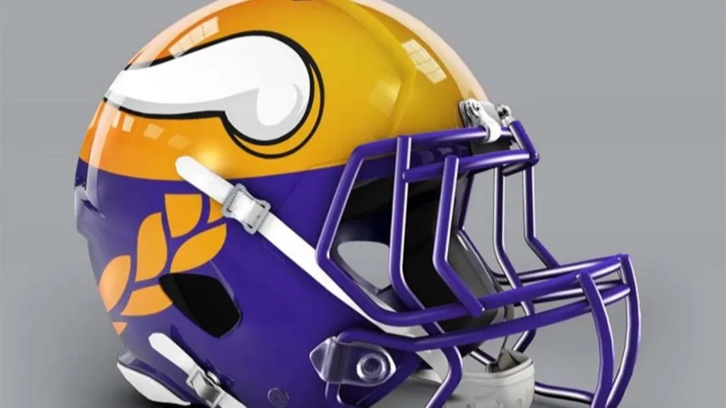
(Paul Bunyan Design)
Undoubtedly this is supposed to look like a yellow Viking helmet with a braid flowing out from underneath. While we acknowledge the creativity and effort, it’s just unnecessary. The Vikings have always been known for their purple, not their yellow. It just seems wrong to emphasize the yellow.
Plus, we’re not a huge fan of putting this braid on the side. The current Viking football helmet already looks good without putting a braid on the side. There’s no reason to change that up for no good reason.
Grade: C-
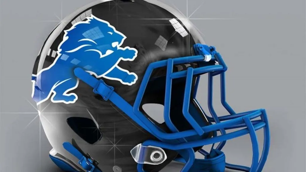
Detroit Lions: Best Design
(Instagram)
This concept knocks it out of the park for the Lions. This is a stunning helmet. The electric blue profile of the lion on top of the midnight black helmet is outstanding. It’s almost like there’s a neon light in the shape of a lion against a pitch-black backdrop.
If there’s a drawback, the blue facemask gets a bit mixed up in the lion outline. But even the facemask in that color looks awesome, so we’ll let it slide. The black and blue are far sharper than the bland gray we’ve seen from the Lions in the past.
Grade: A
Detroit Lions: Worst Design
(Paul Bunyan Design)
Here are two more helmets that appear on the surface to be similar but are actually quite different. While the one above has a matte black finish and dynamic blue coloring, this Lions helmet is an outdated shiny black with dull blue coloring.
This is just the regular Lion’s helmet in black. It’s nothing new and exciting. In fact, it’s not even an upgrade because this one is too sparkly. Also, the blue facemask clashes with the all-blue lion on the side of the helmet. This is a total do-over.
Grade: D
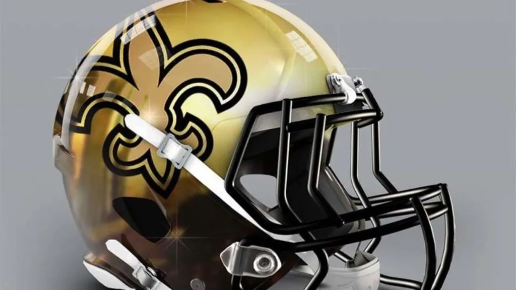
New Orleans Saints: Best Design

(Uni-Watch)
Rarely do we see the Saints with a white helmet or even think of it as a possibility. But this design is growing on us. It’s not that different from the team’s traditional look. They’ve just changed the background and played with the colors a little.
This works really well because of the details and color differentiation on the fleur-de-lis. The gold and black helmet stripe is a nice touch too. Maybe this doesn’t work as the team’s permanent helmet, but it should be pulled out a few times a year.
Grade: A-
New Orleans Saints: Worst Design
(Paul Bunyan Design)
Gradients on helmets are tough to pull off. When done right, they can be very cool. When done like this, they can look like a bad airbrush job you got done at the mall in 1998.
In this case, the coloring on the golden dome is all thrown off. Even the gradient is all over the place as it changes colors. The Saints already have one of the more recognizable helmets in the NFL, so there’s no reason to ruin that with a design like this.
Grade: C-
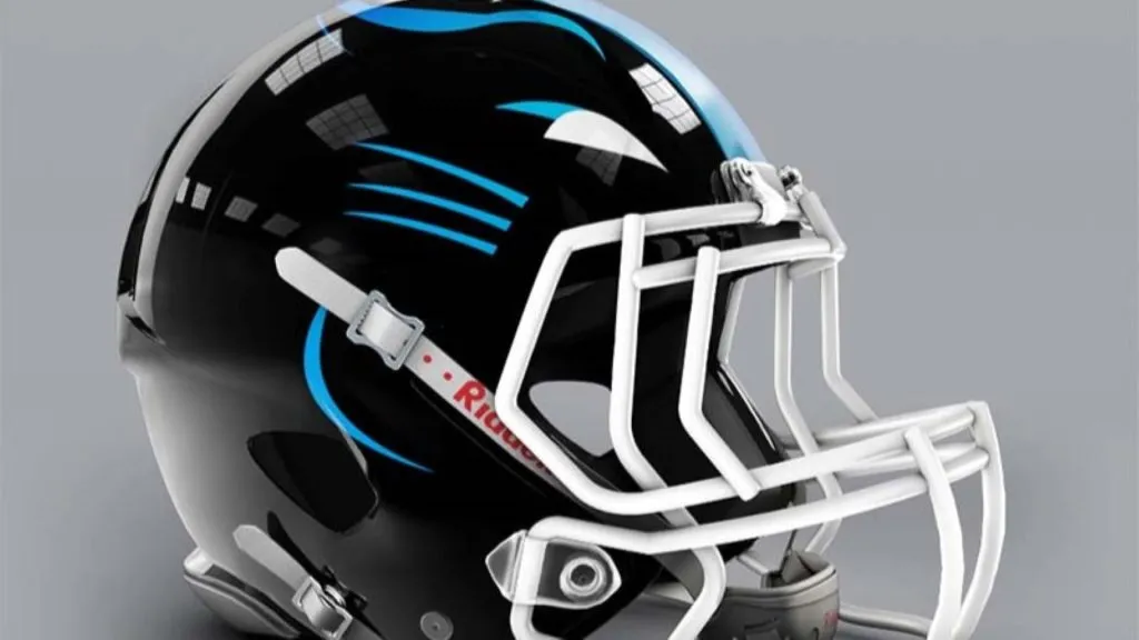
Carolina Panthers: Best Design

(Instagram)
This concept for the Carolina Panthers is excellent. With one of the most unique and attractive color schemes in the entire league, it’s about time they made a bold decision about their uniforms.
The blue helmet is striking. It’s made even better by the black logo and facemask. This shade of blue goes together perfectly with black, especially with the tinge of white we get from the teeth and eyes of the panther logo. Carolina would be wise to make this the team’s new helmet permanently.
Grade: A
Carolina Panthers: Worst Design
(Paul Bunyan Design)
The Panther logo is almost too minimalistic to be seen properly. But when you do realize what’s going on there. it’s no good either. This is another example of trying too hard and trying to out-think the room when it comes to designing a new helmet.
They’ve tried to put the cat face on the front of the helmet so it looks like the cat is facing you when you’re looking at the player. But the front of the helmet just isn’t wide enough to pull that off, and so it doesn’t work.
Grade: F
Atlanta Falcons: Best Design
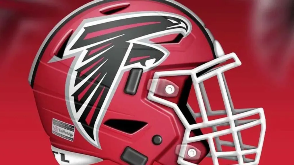
(Uni-Watch)
This helmet is absolutely beautiful. There’s something truly remarkable about a red helmet, assuming you can pull it off. With this design, the Falcons are definitely pulling it off because of the way the red and black look together with just the right amount of white.
Also, this is as good a time as any to let you know that the Falcons logo is a bird in the shape of the letter F. Fans are sure to pick up on that by looking at this helmet, although it’s just subtle enough to look cool.
Grade: A
Atlanta Falcons: Worst Design

(Paul Bunyan Design)
This designer thought they could pull a fast one on us, didn’t they? This is just the current Falcons logo rotated a bit, isn’t it? That’s just lazy and lacks creativity. Even worse, it just doesn’t look that great.
Once you see that the old logo has been rotated, it makes this helmet look utterly ridiculous. Couldn’t they have spent the time to draw a new wings logo if wings were what they wanted? Even if people didn’t recognize the old logo, this still isn’t anything special and wouldn’t be a sharp design.
Grade: F
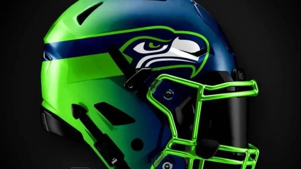
Seattle Seahawks: Best Design

(Ultimate Effects)
The thing that’s great about this helmet design is that the designer used the stripe pattern from the current uniforms on the helmet. That’s a nice touch that didn’t go unnoticed. But that’s not the only thing we like about this helmet.
The green facemask is nice and we’d love to see a green visor on top of it, even if there’s no way the NFL would go for that. Placing the eye of the seahawk on the side of the helmet rather than the entire seahawk is also a nice touch that adds an intimidating element to the helmet.
Grade: A-
Seattle Seahawks: Worst Design
(Instagram)
Seattle has always been on the cutting edge of what’s visually acceptable on a sports uniform. Granted, not everyone is on board with the bright, neon colors they like to showcase these days. But it’s nice to take a chance and try something different.
Unfortunately, this helmet design goes a little too far. The gradient is an eyesore and the shiny facemask doesn’t match the rest of the helmet. Plus, now that we’ve seen how cool the seahawks’ eye looks, seeing the whole thing is a little off-putting.
Grade: D
Los Angeles Rams: Best Design

(Instagram)
This concept has tried to make something decent out of the Rams’ new mess of a logo. It’s the classic rams horn design but with a modern touch. At first glance, it looks a little like a jumbled mess. But when you look closer, you can see the intent.
All things considered, this is a cool design. Those particular shades of blue and yellow blend well together. Even if it’s not our favorite helmet, it’s definitely better than what they’ve got currently.
Grade: B
Los Angeles Rams: Worst Design

(Paul Bunyan Design)
There are some weird patterns and textures going on on this helmet. It looks like the regular Rams helmet from the St. Louis days but the rams’ horn is shiny while the blue background isn’t but has horizontal pinstripes.
It’s a weird look made even weirder by the fact that you wouldn’t be able to see the pinstripes on the helmet unless you were on the field playing in the game. It’s like they tried too hard to improve an old classic but failed miserably, ending up with something we’d rather not see the Rams wear.
Grade: C-
Arizona Cardinals: Best Design

(Ultimate Effects)
This is an example of good execution of an idea that this designer has tried on helmets before. That includes the one below it that we didn’t like as much.
They finally got right the eye towards the front of the helmet. The spacing around the outside is also well done, making it clear what was going on on the helmet. Plus, this is yet another helmet in which red and black are mixed together perfectly because the red is dark and bold, complementing the black.
Grade: A
Arizona Cardinals: Worst Design

(Uni-Watch)
This concept is actually the worst helmet we’ve ever seen. The only discernable feature of the helmet is the eye creeping out of an oddly shaped field of black. But the eye is too close to the front of the helmet rather than more on the side.
We can only surmise that the helmet is intended to be a closeup of a Cardinal’s face. That’s not a terrible idea, but the execution is way off. There’s just too much negative space on this helmet, which is a negative in our book.
Grade: F
San Francisco 49ers: Best Design
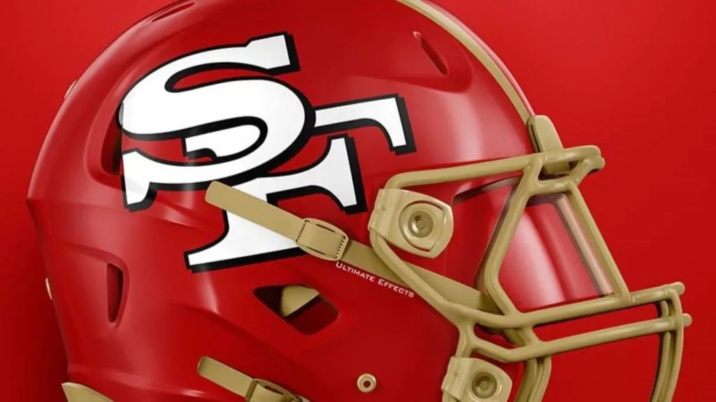
(Ultimate Effects)
This helmet provides a great update and modernization to the 49ers helmet, which hasn’t changed much over the decades. There is some gold on the helmet, but it’s the red that’s the star of the show. That’s the way it should be with the 49ers, who are one of those iconic franchises with a classic look.
Also, who would have guessed that the SF logo would do just fine without that silly ring holding it in place? All things considered, this is a great example of why keeping it simple can work just fine.
Grade: A-
San Francisco 49ers: Worst Design
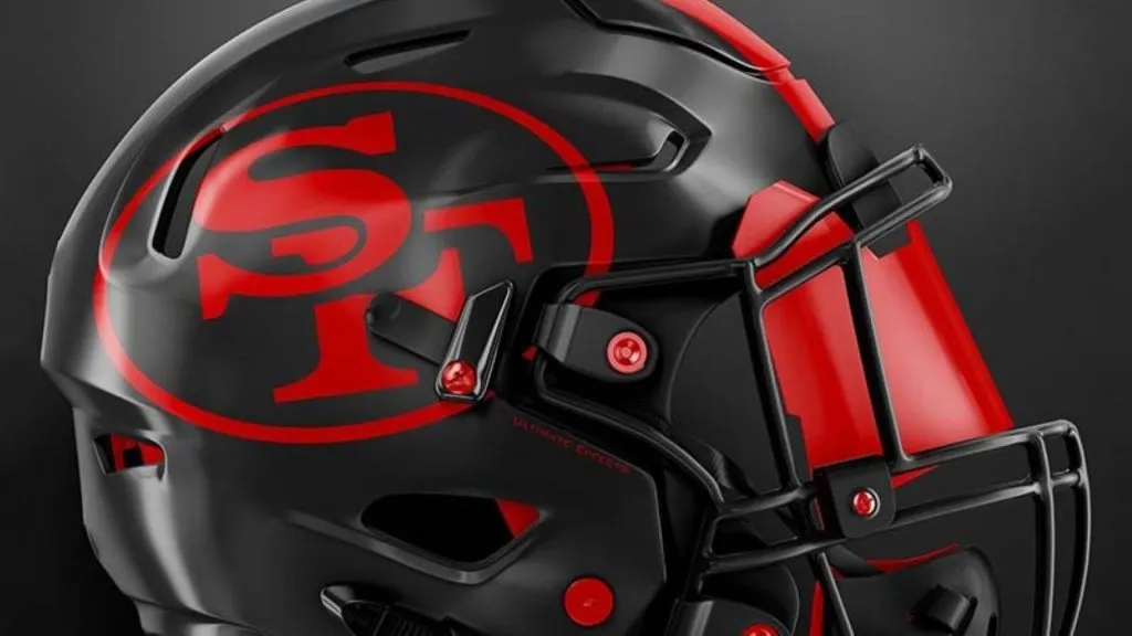
(Ultimate Effects)
There are two main problems with this helmet. The first is that there’s no gold on the helmet. What were the 49ers arriving in California looking for? That’s right, gold. Some might think this looks cool, but it’s completely off-brand.
The other problem relates to the first. The helmet is too dark. We typically like the black and red color combo. But the black is smothering and the red doesn’t do anything to pop without an outline around it. This might work for another team. However, it’s just not a good look for the 49ers.
Grade: C-