A kit is the mark of a team, a proper kit can truly showcase what a team stands for, what that club wants to accomplish on the field. From the elegant home jerseys worn by AC Milan, Real Madrid, or Barcelonato stylish designs from Borussia Dortmund.
Still not every kit design can showcase elegance or competitiveness, some kits just are complete messes. What led these teams to okay these designs will always be a mystery, one thing is for sure, these clubs wore these jerseys to the dismay of soccer fans all over the world.
Here are 25 of the strangest and most bizarre soccer kits ever worn by soccer clubs. Some have been lost to the sands of time, others are designs we’d like to forget.
25. Necaxa third kit 2000
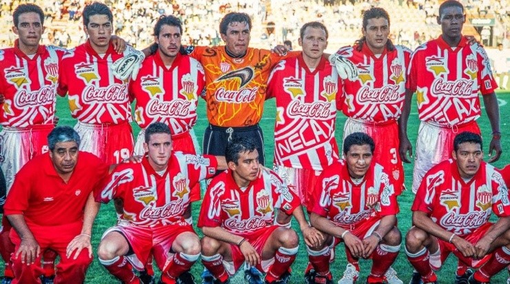
Liga MX teams are known for some weird designs, but Necaxa’s 2000 third kit takes the cake. A superimposed club crest on the shirt itself looked like a towel wrapped around the players.
24. CD Palencia home kit 2016-17
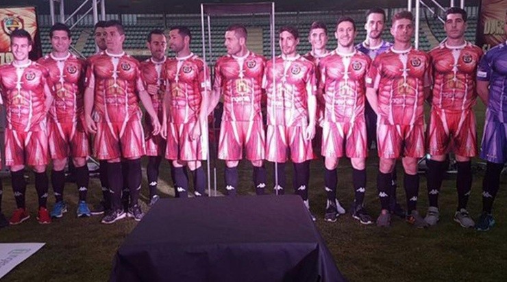
Yeah, a picture speaks louder than words, Spanish lower-league team CD Palencia shelled out a jersey that was the inner layers of human tissue. Yuck!
23. River Plate 75 years of Monumental kit

River Plate in all black? Even their famous white and red logo. The club looked completely out of place dressed in an all-black kit which looked more suited to a funeral than a homage to their famous stadium.
22. Every kit of the 1996 MLS season
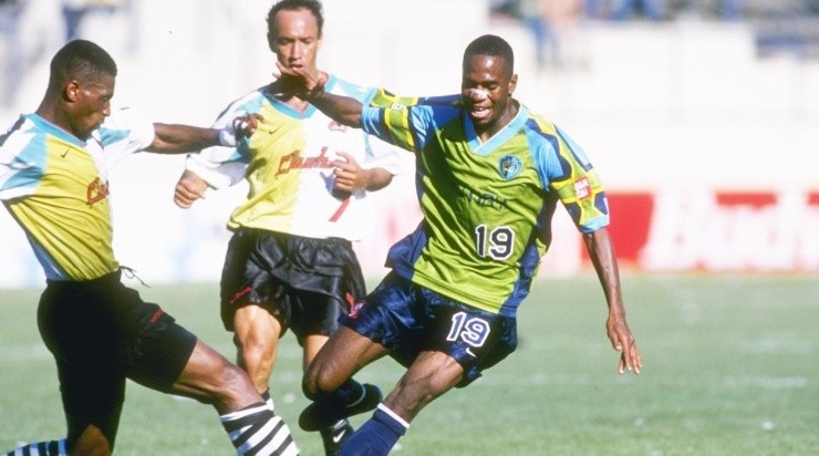
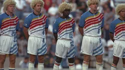
When MLS kicked off in 1996 it was truly the late 90’s, bright neon colors that looked like something henchmen would wear in Batman Forever, crazy sounding names like the Clash, Wiz, and Mutiny, just everything you thought about with 90s skater culture.
21. Atletico Madrid away kit 2003-04
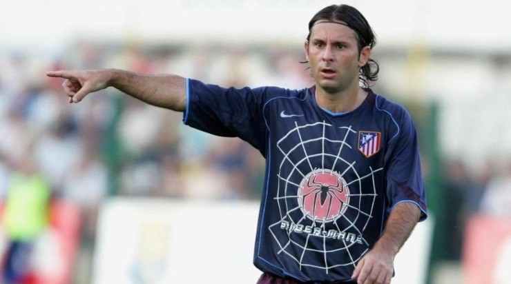
In the early 2000’s Atletico Madrid had a deal with Columbia Pictures in which the club would have the name of the latest movie on the center of their kits. In 2003 for the first Spiderman movie the club went even further with a Spiderman inspired kit that had little to do with Atletico Madrid’s history.
20. Boca Juniors go pink
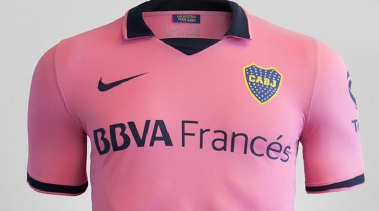
Legendary Argentine club Boca Juniors wore pink at one point in their history to the dismay of their supporters. The jersey was mocked by every other fan base in Argentina and was woefully out of touch with the club.
19. 1999 MetroStars home

The MetroStars played one of the worst seasons in MLS history and are arguably the worst team in MLS’s 27 year existence. They dressed the part as the fumbling Metros would go winless all summer.
18. Real Madrid green kit in 2013

Real Madrid has done a lot to make a buck, one of the worst decisions was to have the team dress in green. Completely uncharacteristic for a club of such elegance, the green kit was downright bizarre.
17. Barcelona yellow kit 2012/13

Barcelona in yellow does not seem off, their Ecuadorian counterpart so to speak plays in yellow, but the style of the jersey is simply not Barcelona.
16. Celtic away kit 1991-92
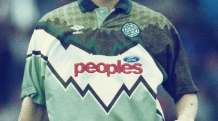
As the 90’s brought about a shift in soccer kits, Celtic went all out in 1991/92 with a strange kit that looked like something you’d find in a 7up can than a soccer jersey.
15. River Plate orange kit

River Plate is back with a kit that pays homage to a ball. Yes. A BALL. In 1986 using an orange ball River defeated Boca Juniors in an Argentine clasico, decades later that ball got a special kit.
14. Real Madrid dragon

In 2014 in an effort to bring their brand closer to the Asian market, Real Madrid decided to place a dragon on their jersey. The idea was a marketing stunt, so the executive got points for trying, but while nice, the kit has little to do with Real Madrid.
13. Stoke City – 1996/97
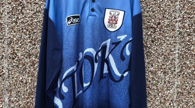
In case you didn’t know what team was on the field, Stoke City made sure you knew by the end of the match with a rather cheap blue kit with the word Stoke written across it.
12. Inter Milan third kit – 2016/17

In 2016 Inter Milan wore these kits that looked better suited for a night on the town in Miami than a competitive soccer match at the San Siro.
11. USMNT 2021 wave kit

For a while now the USMNT have worn “whatever” as kits, in 2021 their “wave” kit looks like wrapping for chewing gum than a soccer kit but hey, they did win the Gold Cup and Nations League playing in those.
10. Argentina Bielsa era home kit

Reebok were the uniform supplier of Argentina for a brief period during the Marcelo Bielsa era. In their exceptional 2002 World Cup qualifying campaign the Argentine’s wore a strange home jersey that lacked the legendary stripes.
9. Borussia Dortmund home kit 2006-07

Never have white and yellow stripes looked out of place than in Borussia Dortmund’s home kit in 2006. There was massive fan outcry over the change in traditional color scheme and never has a change like this happened again.
8. Juventus 2011-12 Away Kit

Putting Juventus in pink and slapping a black star on the jersey, the Italian Old Lady looked terribly out of place. It is one of the worst looks for Juve in their history.
7. Liverpool third kit 2013-14
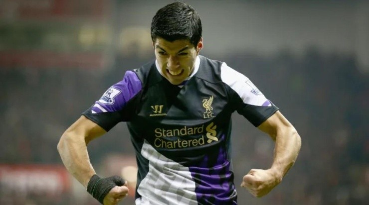
The Liverpool third kit in 2013 looked like pieces of jerseys were stitched together to make a kit. Also, the color pattern is so not Liverpool, a horrid design for such a storied club.
6. Independiente away jersey 2014
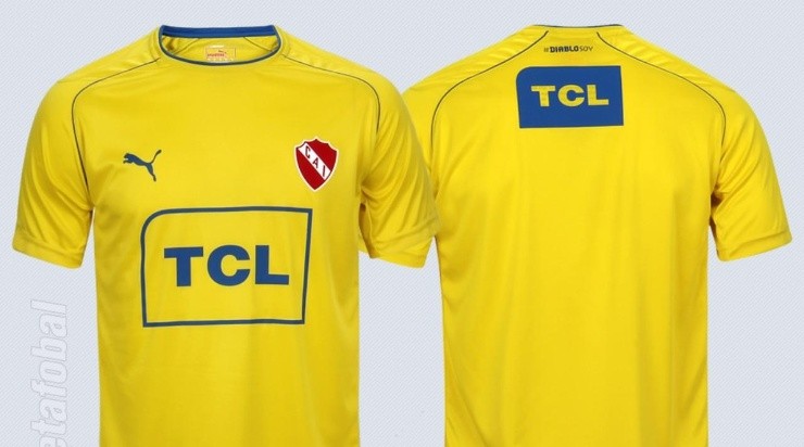
No, it’s not Villarreal but Independiente of Argentine soccer, the storied club wore an out of place yellow kit that was hated by fans and is considered one of the worst kits in club history.
5. Las Vegas Lights 2021 kit
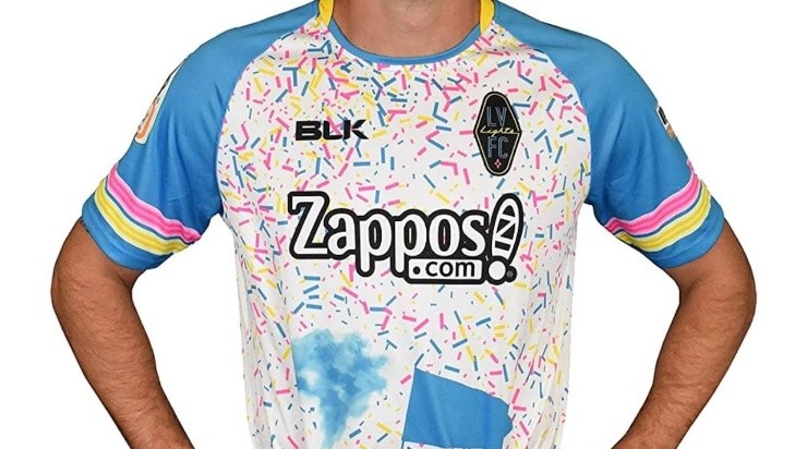
The Las Vegas Lights have had strange kit designs since they began back in 2017. Their 2021 kit is strange to say the least, a lot going on for a club that has had promos of throwing money on the field so fans can grab as much as they can.
4. USA 1994 World Cup kits
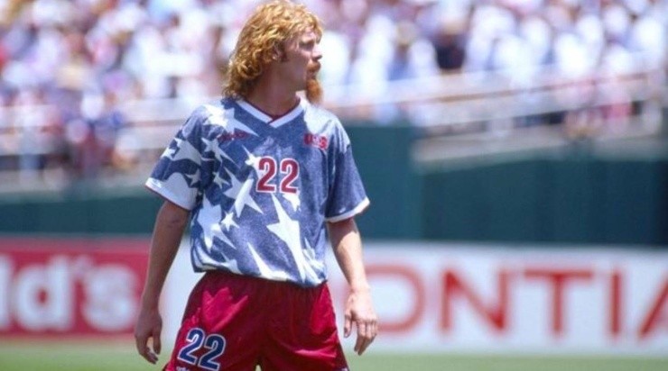
When the USMNT presented their 1994 World Cup kits that had them wearing denim with white stars and red shorts, the fear that the team would flop at the World Cup wearing those kits had many fans in a paranoid state of mind. The USMNT avoided being a laughingstock and defeated Colombia, tied Switzerland, and more than held their own against Brazil in the round of 16. The kits, while not exactly pretty, are endeared to the soccer community.
3. Hull City home kit 1992/94
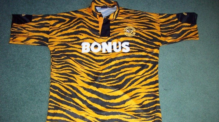
Hull City wore tiger stripes as their home kit for two seasons, the team looked downright yuck wearing those jerseys. And the fans had to put up with it for 2 years!
2. Cultural Leonesa (home & away) 2015-16
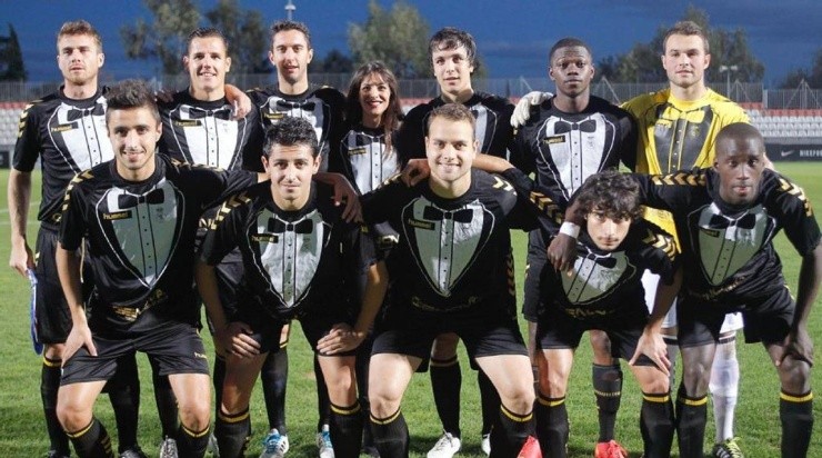
Dress for success, that is what Cultural Leonesa did in 2015 when they shelled out black and white tuxedo inspired kits for the season, which included a bow tie!
1. Colorado Caribous away kit 1978
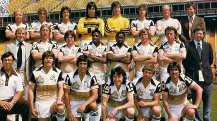
My lord, the NASL was a strange league and for only one season the Colorado team wore tasseled faux-leather fringing across the chest and back. It is one of the worst sports jerseys in history and thankfully the team was gone after just 1 season.
