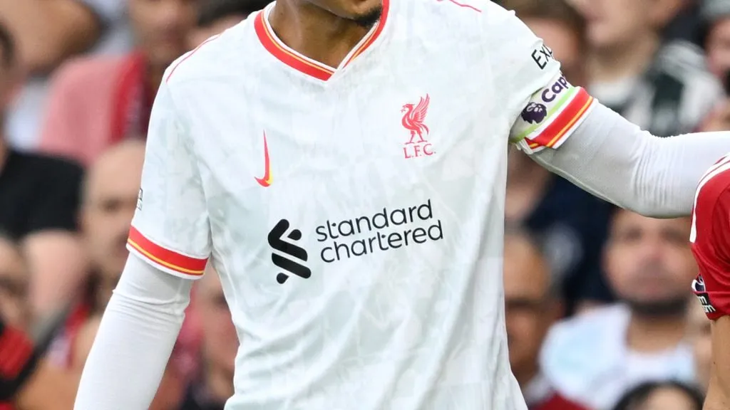
For Matchday 3 of the English Premier League, Manchester United welcomed Liverpool to Old Trafford. Notably, the visiting team wore their third kit, which featured a unique twist: the Nike logo was not displayed as it usually is.
Throughout history, football clubs have introduced countless jersey designs for home and away games. In recent years, third kits have also been incorporated for special occasions.
For instance, Liverpool FC wore their third kit for the match against Manchester United. While their primary colors of white and red were maintained, what stood out was the altered sponsor logo, differing from its usual appearance.
The question now is: Why does the Nike logo appear differently on Liverpool’s jersey? The Reds showcased a jersey where Nike’s iconic swoosh is displayed vertically rather than horizontally, which caught the attention of spectators.

Bruno Fernandes of Manchester United reacts as Virgil van Dijk of Liverpool pats his back during the Premier League match between Manchester United FC and Liverpool FC at Old Trafford on September 01, 2024 in Manchester, England.
What’s behind this change?
The unique feature seen on Liverpool’s third kit during their visit to Manchester has an explanation from the brand outfitting the team: Nike have changed their logo on third kits to celebrate women’s football.
In a video posted on their Instagram account, Nike announced the reason behind the decision to alter the logo for third kits: “Unveiling The 2024/25 Club third kit collection, Together We Rise, built to celebrate the women’s game from grassroots to greatness,”
Liverpool and other clubs featuring this distinctive logo
Not only did the English team take the field with this unique logo change due to a Nike campaign, but other European clubs will also feature this detail on their third kits throughout the 2024-25 season.
- Tottenham Hotspurs (England)
- Atletico Madrid (Spain)
- Chelsea FC (England)
- Inter Milan (Italy)
- Pumas UNAM (Mexico)


