The Chicago White Sox were founded in 1901 and are one of the American League’s eight initial teams. In their 119-year history, the White Sox hasclaimed the World Series on three occasions in 1906, 1917, and in 2005. Theyhave claimed six American League pennants,three Central Division titles, and two Western Division titles.
The White Sox are one of the few teams to never have played anywhere else prior, they were founded in Chicago and have played there their whole history. The White Sox call Guaranteed Rate Field home and they play in the Southside of Chicago. Some of the team’s classic players include Frank Thomas, Shoeless Joe Jackson, Luis Aparicio, Carlton Fisk, and Bo Jackson. Ironically the White Sox share a similar history to their hometown rivals the Cubs, both have three World Series and are two of Baseball’s oldest clubs.
The Chicago White Sox MLB soccer jersey takes its inspiration from Chicago’s urban city murals while the away jersey takes its inspiration from the Chicago city flag stars. They are a different approach from some of the other jerseys we have done, we wanted to give them a unique look as we did with the A’s, Dodgers, and Rangers.
Chicago White Sox City Mural Home Jersey


The home jersey is inspired by the urban street art murals of Logan Square, the neighborhood is home to various murals that inspire different messages of community and gentrification. The White Sox are all about community and these jerseys showcase that unity through the community murals. The typography of the jersey takes its inspiration from the White Sox logo.
On the back, the four stars that make up the Chicago Flag are present along the neck. The club logo is present on the numbers as well as the crest. The jersey maintains the club’s black and silver colors and showcases them in a different light with the inclusion of the Urban Street art style.

As noted earlier the main inspiration for the overall look was the city murals. A close up of the jersey shows how the designs from some of the murals’ lettering are incorporated into the jersey following the White Sox primary logo typography. The city of Chicago is home to tens of thousands of square feet of murals that are located on bridges, buildings, and train stations.

On the neck the four stars that are present are fromthe city flag. The six-pointed stars represent Fort Dearborn, the Great Chicago Fire, World Columbian Exposition, and Century of Progress. Other stars have been petitioned but for now, the city flag only has these four.
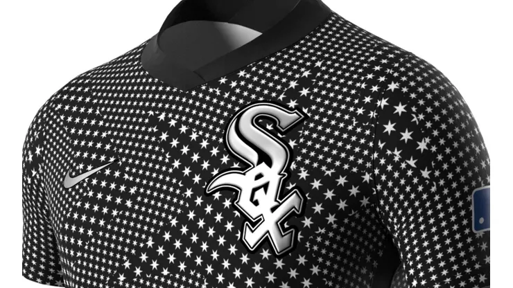
Chicago White Sox jersey inspired by the city flag


The away jersey takes the city flag and uses the stars as the inspiration for the jersey. Created in 1917 the flag initially had two stars, until 1933 a third was added and the fourth since 1939. While on our jersey there are more than 4, if you look closely the four stars are present in the design as they go from largest to smallest, and the smallest closes in on the White Sox crest.

The crest is the White Sox team logo and has been around since 1991. The White Sox have had various logos throughout their history, in total 19! So, they have gone through various facelifts, but the white and silver since 1991 and havelargely been untouched.
On the neck of the away jersey, the club’s alternate logo is present. A simple design that has a white sock embedded on a baseball diamond. A fitting image of what the White Sox are, a baseball team that plays in white socks. The logo has been around since 1990 and along with the crest has been the club image ever since.
We have one more jersey to go! What do you think of our series so far? Up next the White Sox cross-town rivals, the Chicago Cubs.