In our MLB soccer jersey series, we took such classic teams like the Yankees, Red Sox, A’s, and Dodgers and gave them a makeover into the world of soccer. Many of our concepts were inspired by the club’s history and aspects of the city in which they play in. To say that it did not catch the eyes of fans is an understatement. We had an incredibly positive response to the jerseys.
Now we decide to showcase all the jerseys in one place! In a ranking whereall 20 concepts, both home and away can be appreciated by MLB fans and soccer fans alike. Some of the jerseys went from the traditional to the wacky to urban. So, sit back and enjoy our ranking and see these MLB teams like you have never seen them before!
20. NEW YORK METS AWAY JERSEY INSPIRED BY THE 7 TRAIN

For the New York Mets we got creative for the away jersey, paying homage to the 7 train, a train that starts near Citi Field, and ends at the heart of Times Square. Met fans cram into the elevated train to get to Citi Field to catch games after work or on those long hot summer days. The jersey features the classic violet color that represents the 7 train. Another element is the graffiti, the word Mets are written across the neck in classic New York City graffiti lettering.
19. SAN FRANCISCO GIANTS HOME JERSEY INSPIRED BY THE TEAMS TRADITION

This home jersey concept takes the classic white Giants look and adds stripe elements that represent the aesthetic design of the cables of the Golden Gate Bridge. There are eight stripes that represent the club’s eight world championships that start on the sleeve and work their way down. On the back, the classic Giants logo is spread on the neck and the numbers have the cap logo at the bottom, something very common in the world of soccer like in the English Premier League and Major League Soccer to have the league logo present on the numbers.
18. NEW YORK YANKEES AWAY JERSEY INSPIRED BY THE FAMOUS NEW YORK CITY SUBWAY SYSTEM

The away jersey is inspired by the New York City subway system. The design consists of the different subway lines with their respective train lines, which run along the jersey on a blue background, respecting the identity of the team. If you are ever in New York and want to catch a Yankee’s game depending on where you are at, you will most likely take the No.4, D, or B train to get to the ballpark. The point where the lines meet is where the fans get off the train to get to the stadium just below the logo, representing Yankee Stadium as the final destination.
17. DETROIT TIGERS HOME JERSEY INSPIRED BY THE TIGERS NAME

The home jersey is inspired by the Detroit Tigers name and follows a tiger stripe pattern. The club’s classic team logo is what is used as the crest and the classic orange, white, and dark blue color patterns are maintained in different areas of the jersey. The Tigers are in rebuilding mode if they want to come back and strike fear in their opponents with this home jersey it will make Comerica Park a tough place to play.
16. NEW YORK METS HOME JERSEY INSPIRED BY THE CLUBS QUEENS ROOTS

The home jersey takes the New York Mets classic color patterns, but transforms them to have the look and feel of the world-famous Unisphere located in Flushing Meadows Park, a few minutes’ walk from where Citi Field and the old Shea Stadium is/was located at. Anyone who visits Citi Field or goes to see a Mets game on the 7 train or by car cannot miss seeing the Unisphere as they approach the stadium. The Unisphere was built in the 1960s as part of the 1964 New York World’s Fair and is a fixture of Queens and a tourist attraction.
15. CHICAGO WHITE SOX AWAY JERSEY INSPIRED BY THE CITY FLAG

The away jersey takes the city flag and uses the stars as the inspiration for the jersey. Created in 1917 the flag initially had two stars, until 1933 a third was added and the fourth since 1939. While on our jersey there are more than 4, if you look closely the four stars are present in the design as they go from largest to smallest, and the smallest closes in on the White Sox crest.
14. L.A. DODGERS HOLLYWOOD INSPIRED AWAY JERSEY

The Dodgers away jersey takes inspiration from Hollywood and the glitz and glamour of Los Angeles. The red star pattern is a characteristic of L.A. when you think of the Hollywood walk of fame and the gold pattern of the logo and team name on the chest is that in homage to the Oscar. The Hollywood elite shine in Los Angeles and the Dodgers don’t want to be an exception, a more Hollywood look that takes you out of the regular white and blue colors of the Dodgers.
13. OAKLAND ATHLETICS AWAY JERSEY HOMAGE TO THE CITY‘S MURALS

The city of Oakland has more than 1,000 murals, making the city itself a street art museum. Various street artists from all over the world come to the city to leave their mark around the streets of Oakland. Some of the best murals can be found in Alice street, Chinatown, and the Jack London district. It is here where our very urban style away jersey takes its inspiration and gives the A’s a totally different look.
12. TEXAS RANGERS LANDSCAPE AWAY JERSEY

The away jersey pays homage to the great landscapes of Texas. In this case, we have incorporated silhouettes from Guadalupe Mountains National Park, located in El Paso, Texas. The jersey incorporates the classic Texas mountains and the white “T” serves as the crest to make the logo stand out. On the back along the neck, there is a sign that refers to the team’s foundation in 1961 and has the team nickname on the back “The Lone Stars”.
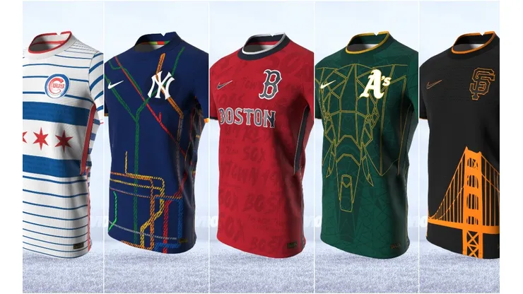
11. CHICAGO CUBS WRIGLEY FIELD INSPIRED AWAY JERSEY

The away jersey pays homage to the iconic ballpark Wrigley Field. Built in 1914, the stadium is known for its ivy-covered brick outfield and the red marquee over the main entrance. A unique aspect of the stadium is that it is located in a residential area and has no parking lots and fans can watch the game from the rooftops of the apartment buildings facing the ballpark. It’s not uncommon for home runs to fly as far as those buildings and fans on the roof to catch them. The jersey has the primary red color to honor the famous marquee and the ivy bricks can be seen running along the jersey.
10. RED SOX HOME JERSEY INSPIRED BY THE PASSION OF THE FANS

The Boston Red Sox MLB inspired soccer jersey pays homage to the classic colors of the club while also making red the primary color to represent the passion of the Boston Red Sox fans. After so many years of frustration fans still flocked to Fenway Park in hopes that the Red Sox would turn their history around and they did in 2004, it’s hard to find a more rabid Baseball fan base than the Red Sox fans.
9. SAN FRANCISCO GIANTS AWAY JERSEY INSPIRED BY THE GOLDEN GATE BRIDGE

The away jersey pays homage to the characteristic bolts of the Golden Gate Bridge’s structure via a pattern that runs throughout the entire jersey. On the front of the jersey, there is a clear image of the bridge that stands out for its orange color. On the sides of the jersey, the words “Orange and Black” are present, which is one of the team’s nicknames. The word “Giants” is formed by the darker points that run along the chest of the jersey.
8. DETROIT TIGERS AWAY JERSEY INSPIRED BY THE MOTOR CITY

We got really creative with the away jersey, we thought what else truly signifies Detroit and that is the American automotive industry. Detroit has widely been recognized as the “Motor City” because of the various automotive companies that are located in the state of Michigan: Ford, GM, Chevrolet to name a few. The jersey pays homage to that industry with a car design so to speak.
7. RED SOX AWAY JERSEY INSPIRED BY THE GREEN MONSTER

When you think of the Red Sox and Fenway Park no other image comes to mind than the Green Monster. “The Wall” stands at 37 feet and 2 inches high and is 310 feet from home plate and is a very popular target for good right-handed hitters.The Green Monster has a famous manual scoreboard which is operated by Red Sox staff and has been there in one way or another since 1914. The away jersey takes from that trademark element and has the scoreboards lettering and foundation year on the back of the jersey. The Green Monster is one of the most photographed elements of Fenway Park by visiting fans.
6. L.A. DODGERS HOME FIELD INSPIRED JERSEY

Drawing inspiration from the history of the Dodgers and Dodger Stadium, the legendary home ground of the club, the jersey has a hexagonal pattern that refers to the scoreboard, signs, and different design aspects located around the ballpark. Built in 1962 the stadium is well accustomed to hosting big time events, Dodger stadium have hosted the 1980 MLB All-Star game, 10 World Series editions, and the World Baseball Classic on two occasions. Dodger Stadium has also been host to a few soccer teams: L.A. Galaxy, Real Madrid, Everton, and Juventus.
5. CHICAGO WHITE SOX CITY MURAL HOME JERSEY

The home jersey is inspired by the urban street art murals of Logan Square, the neighborhood is home to various murals that inspire different messages of community and gentrification. The White Sox are all about community and these jerseys showcase that unity through the community murals. The typography of the jersey takes its inspiration from the White Sox logo. On the back, the four stars that make up the Chicago Flag are present along the neck. The club logo is present on the numbers as well as the crest. The jersey maintains the club’s black and silver colors and showcases them in a different light with the inclusion of the Urban Street art style.
4. NEW YORK YANKEES HOME JERSEY INSPIRED BY THE TEAMS RICH HISTORY

The New York Yankees are one of the MLB’s most historic clubs. Founded in 1901 they have won 27 World Series and have had some of the most iconic baseball players on their roster. From Babe Ruth to Derek Jeter the New York Yankees are a symbol of excellence in the American sporting landscape. They are a staple of the city of New York like eating a hot dog in Times Square or riding the subway to work. Transferring that rich baseball history to the soccer world was no easy task, but we gave it a shot and we think we were able to capture the essence of the Bronx Bombers and what they represent to the city of New York and MLB fans in general.
3. TEXAS RANGERS COWBOY HOME JERSEY

The home jersey is inspired by the Texas Cowboy, via the design, we emulate the classic cowboy tartan vest and shirt. The color patterns are the Rangers classic red, white, and blue, and what isn’t all American like a cowboy? The crest is the classic sheriff’s badge and plays off of the phrase “The Lone Star” state. Within the badge is the Rangers cap logo, the “T”, is present in blue tone. On the back, the Texas flag runs along the neck as the jersey incorporates every element from Texas from the sheriff’s badge, the cowboy, and the state’s primary colors.
2. OAKLAND ATHLETICS THE ELEPHANTS HOME JERSEY

The Oakland A’s nickname goes way back to 1902 when then New York Giants manager John McGraw used the term “The White Elephants” with anger because the team manager Connie Mack was spending money to improve the team without supervision according to McGraw. Well, Mack liked the term, and to defy McGraw incorporated the Elephant as the team insignia. That addition has stayed as the club’s secondary logo until this day. The elephant on the front of the jersey is facing forward charging at the opposition, as a way of intimidating the opponent. If you go to the Oakland Coliseum you will find Stomper, the team mascot, who is a white elephant and has been around the club since 1997. So, Stomper provides entertainment for the fans while the elephant on the jersey provides all the intimidation.
1. CHICAGO CUBS HISTORICAL HOME JERSEY

The home jersey is inspired by the Chicago city flag and the club’s Hall of Famers. Over the years great players have played for the Cubs and the jersey pays homage to those baseball legends. Players like Ernie Banks, Frank Chance, Kiki Cuyler, Billy Williams, Lee Smith, Hack Wilson, and Greg Maddux have their names present. When the Cubs won the 2016 World Series, they ended the biggest drought in American sports history, it took the Cubs a total of 108 years to win another championship. And we thought the Red Sox were cursed. Cubs fans have a lot to cheer about nowadays as the club has been competitive and has been to the postseason every year since their championship run in 2016.
That is our ranking from 20 to 1! Which jersey was your favorite? Did we choose the right one? We feel that if these teams played soccer these would be some really nice jerseys or kits as the Soccer experts say.